Mobile Energy's New Logo Design
It has been suggested that a company’s logo is its “voice,” in contrast to its “face,” which is the company’s website.
It’s vital for people to remember your logo since it serves as a visual representation of your brand’s identity. In the first few seconds that a new visitor spends on your website, your logo is the first and most important thing they see.
If you’re based in Mobile, Alabama or the nearby region, you can take advantage of Mattgraphy Logo & Website Design, LLC’s professional logo design services to elevate your brand, propel your company’s expansion, and forge meaningful connections with your target audience.
It may seem challenging to capture the essence of your business in something as little as a logo. Our staff has more than 15 years of expertise in the marketing and advertising industry, so we can create a logo that is perfect for any use, including websites, stores, and promotional materials.

The logos we develop for you will represent your unique company in every detail, from the color scheme to the fonts. Here, we’ll examine the progress we’ve made on a recent project for Mobile Energy.
About Mobile Energy
Mobile Energy produces electricity by using a natural gas fired combustion turbine or CT to drive a generator. The hot exhaust gases produced by the CT heat water in tube bundles located in the Heat Recovery Steam Generator or HRSG, thereby producing steam that is directed to the Steam Turbine or ST. The steam turbine then uses this steam to drive a generator. The steam used by the ST condenses in the condenser and is pumped back to the low pressure drum of the HRSG to repeat the cycle. The use of the exhaust of one generator to produce steam to drive a second generator is what makes this a combined cycle process. The electricity produced by both generators is dispatched to the Southern Company’s electrical grid.

Designing the Concept
The plant administrator, Melonie Sikes, asked Mattgraphy to make a logo and marketing materials for Mobile Energy and Ethos that would help them build their brand in the energy industry. The proposed company logo was very cluttered when the new business first approached it. It also lacked personality and was neither memorable nor distinct, so a new look was needed.
After doing our research, we did a sketching exercise. The solution was based on the Alabama state bird and the physical features of the land where the facility is located.
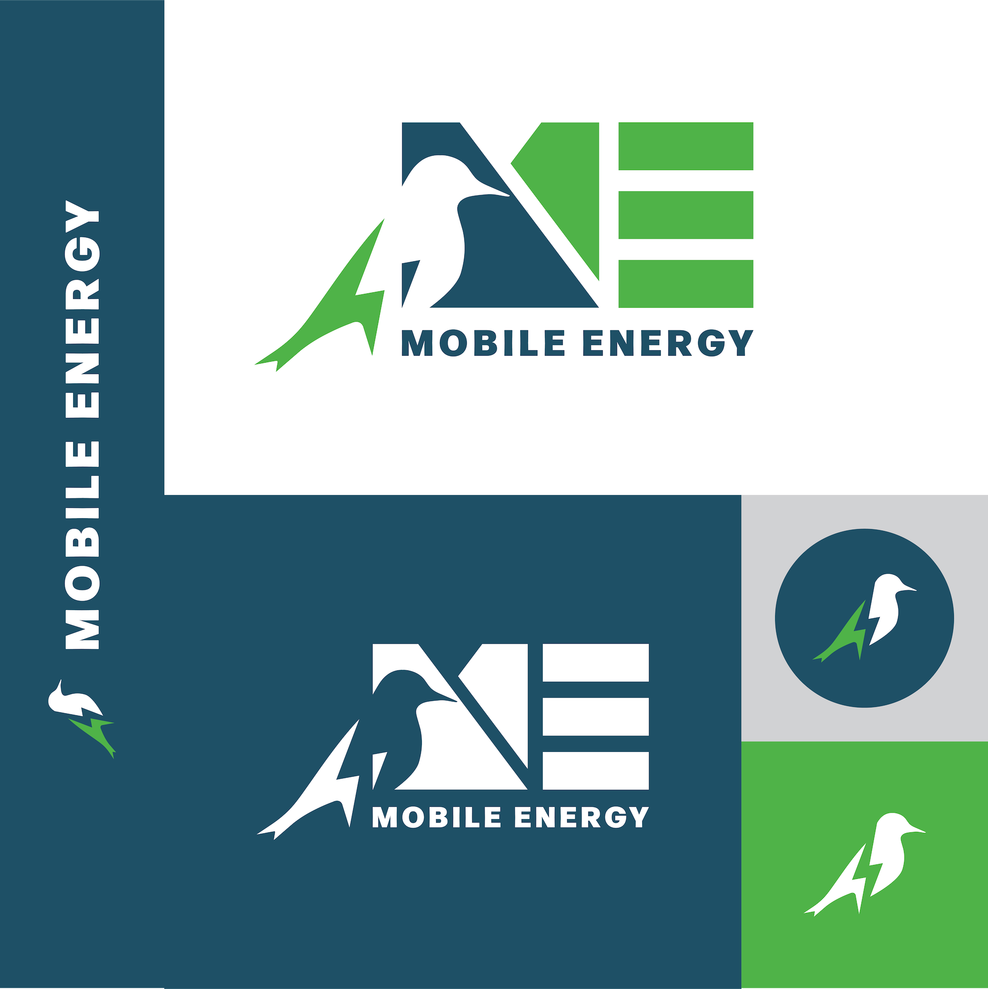
With an elegantly descriptive name like Mobile Energy, it felt appropriate that the company have a distinct logo design that would help to symbolize what the product does. To achieve this, a monogram of the letters M and E was designed that contains the ideas of an energy bolt, energy levels, water, land, and the northern flicker, also called the yellow hammer. This design’s color scheme shows how energy and other earth resources are used. With one of the most important sources of energy being the sun, we decided to make use of the color white. Since there are numerous plants and trees all around Mobile Energy, we chose the color green to represent land and renewable energy. Since the water does a great job of soaking up the extra heat in the air, which delays the full effects of global warming, we added the color blue to represent that company, which is also on Hog Bayou. These three colors listed have two common factors: The sources that they synthesize are visible near the facility, as is their use of energy.
The combined shapes that make up the letters M and E, along with the silhouette of the flicker, come together to give the illusion of the bird resting along the bank of Hog Bayou, looking towards the facility.
The end result is a unique, easy-to-remember logo that works well at many different sizes. This means that the new logo will work well for the company now and for many years to come.
