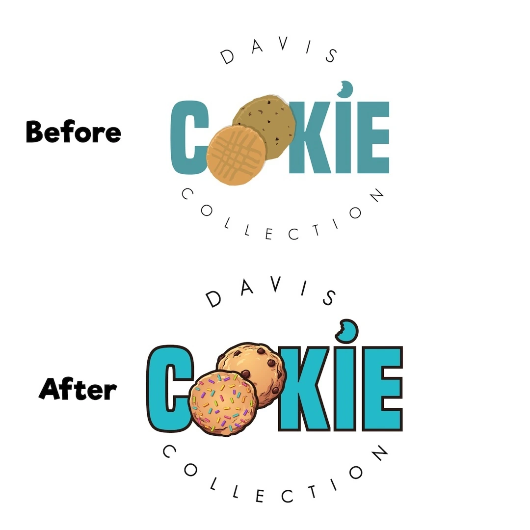
Davis Cookie Collection — Logo Design
A bakery identity refinement that brings a cookie illustration into the Davis Cookie Collection name.
Instagram archive · 2020
Project overview
A bakery identity refinement that brings a cookie illustration into the Davis Cookie Collection name.
Visual direction
The presentation compares an earlier typographic direction with a more descriptive treatment, replacing a simple letterform with a detailed cookie image. Turquoise lettering provides a bright and recognizable color anchor.
Design in context
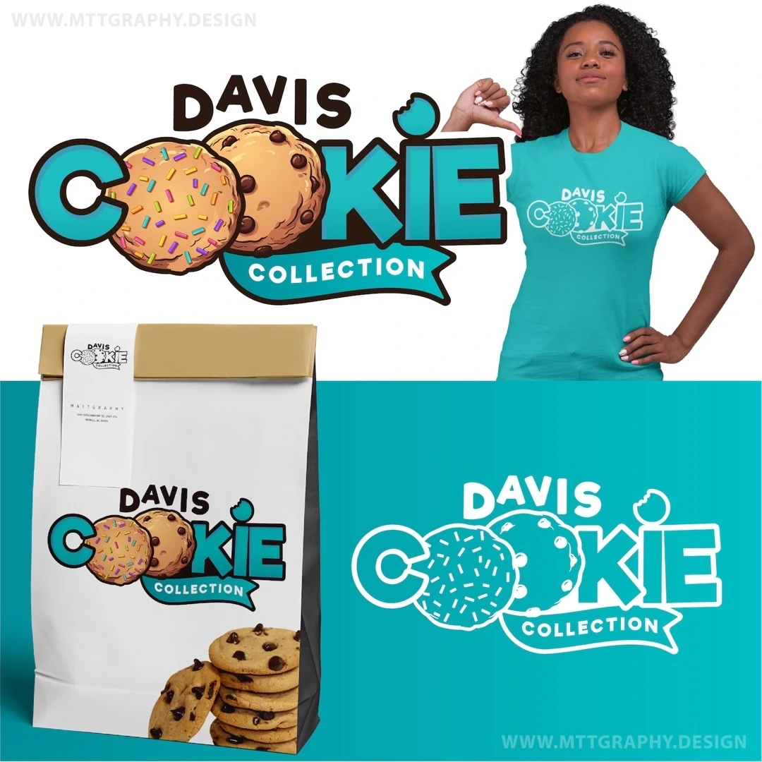
A shirt mockup and full-color lockup show how the refined name and product reference work together as a single bakery identity.
Logo design and visual identity
The identity is presented through its central mark, supporting typography and contrast treatments. These elements establish the visual hierarchy: the symbol creates recognition, the name identifies the brand, and the smaller descriptor supplies context. Viewing the artwork together makes it possible to assess the logo’s proportions and personality as a complete brand identity. The presentation keeps the design visible at its original aspect ratio so the details of the lettering and illustration can be appreciated.