A selection of identities, digital products, websites, print and civic experiences.
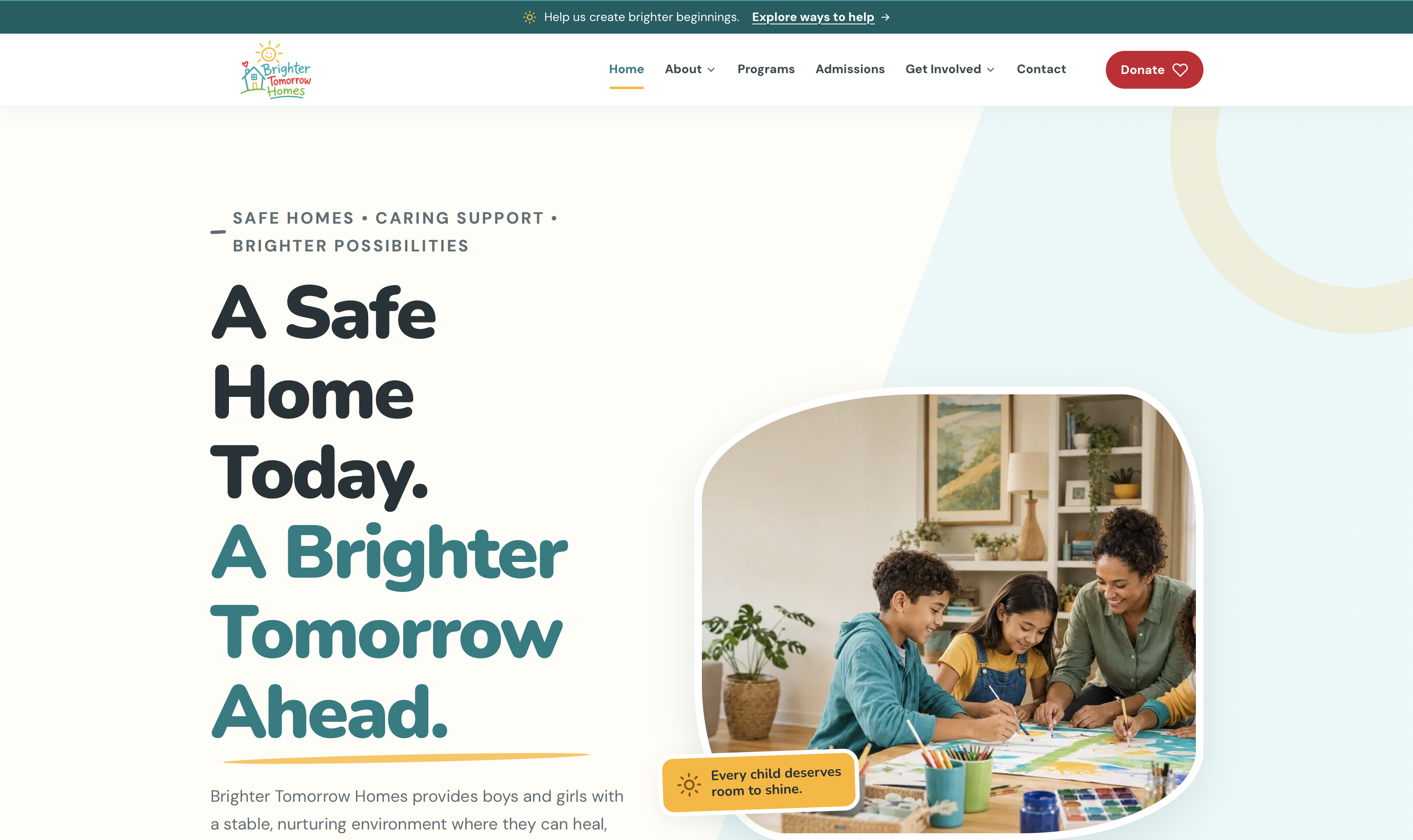
A responsive nonprofit website designed around clarity, dignity, and trust.
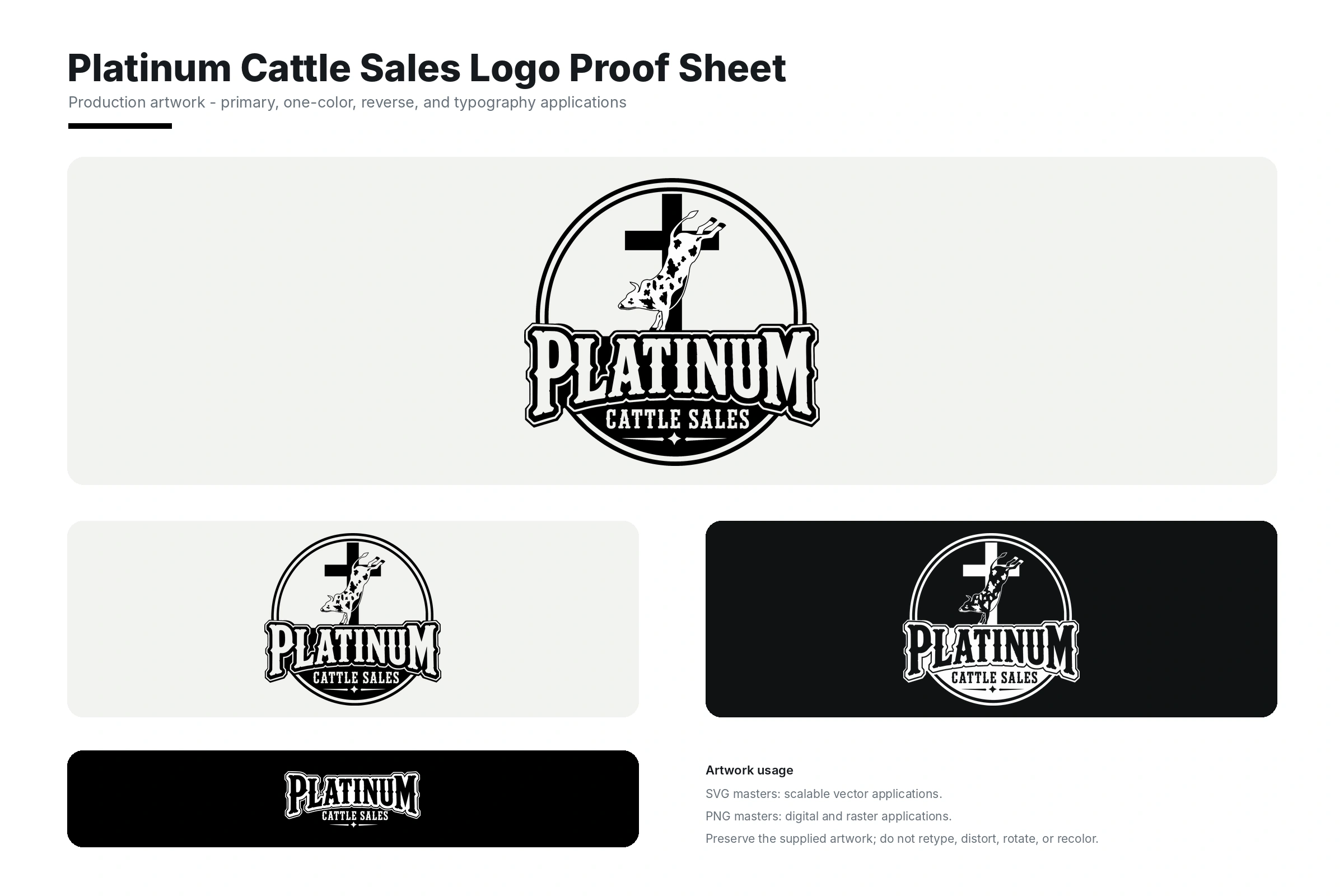
A bold cattle-industry logo built around a distinctive livestock illustration and western-inspired typography.
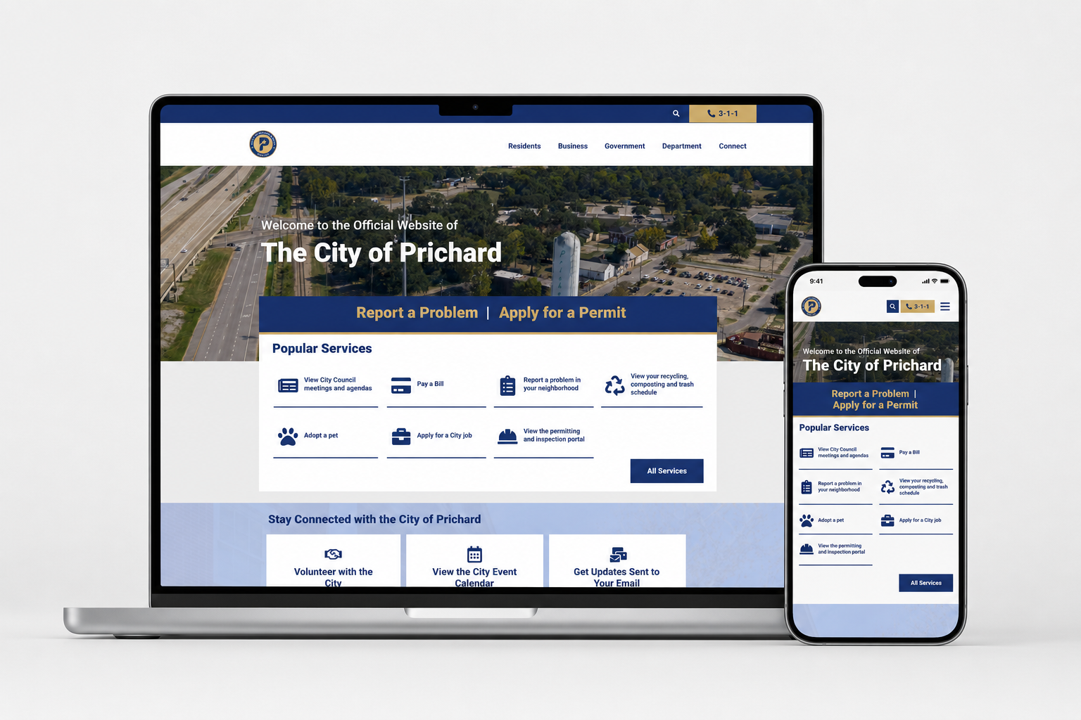
A service-centered municipal website designed to make city information easier to find and act on.
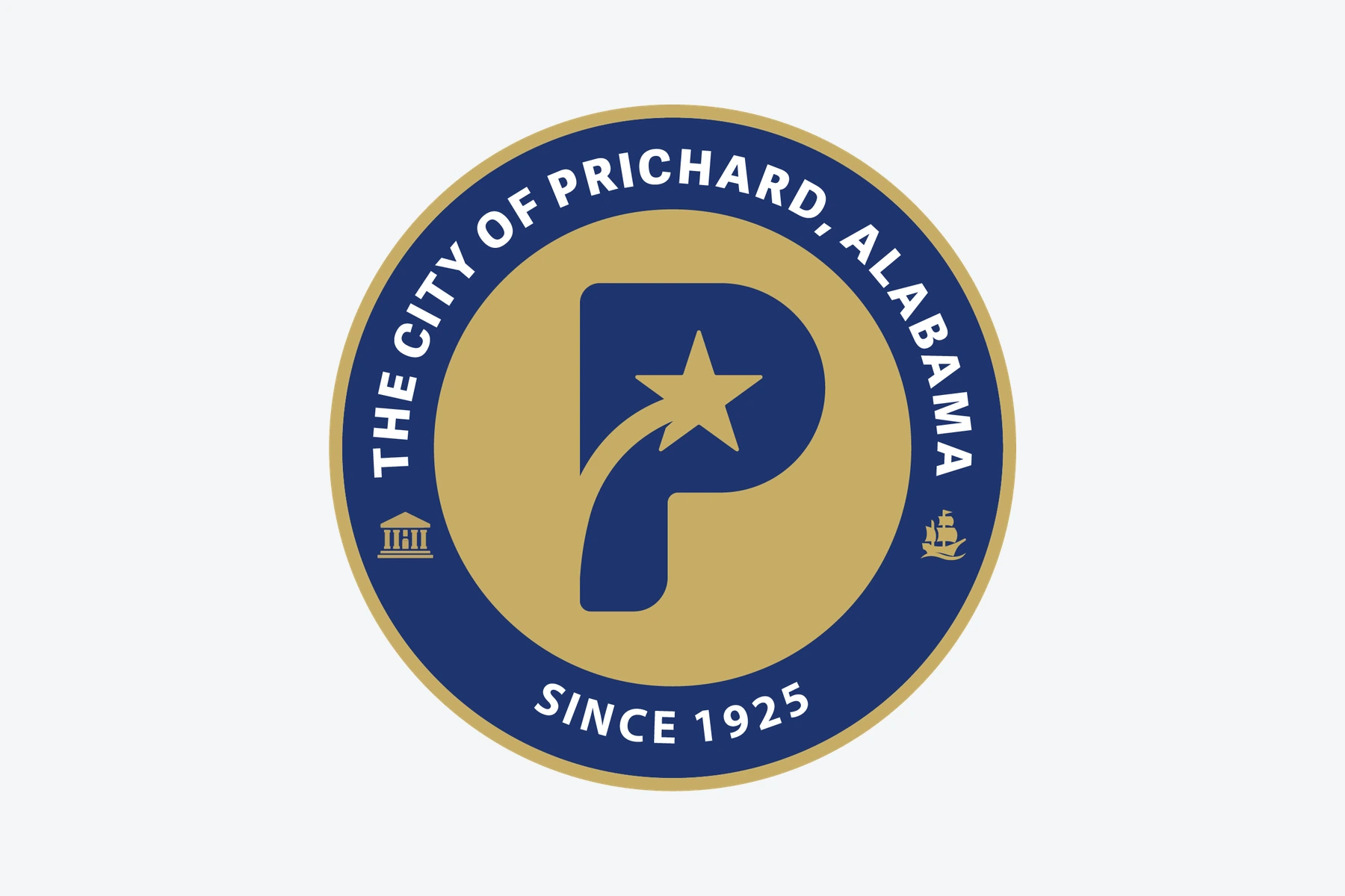
A civic identity built around a star-led P monogram.
Architectural linework meets a restrained typographic signature.
A circular S emblem with a quiet, botanical character.
A cattle-industry emblem with bold Western lettering.
Expressive script, a sweeping K and a spectrum of color.
Equipment-led illustration for a land-services identity.
A compact geometric C with a clear typographic companion.
Palm silhouettes and coastal lines for an apartment identity.
A red P and a house outline in one compact mark.
A playful ice-vending badge with an expressive cast.
A welcoming house, a bright sun and hand-drawn lettering.
A high-energy mascot composition for bounce-and-slide fun.
A cyan panel anchors a streamlined corporate wordmark.
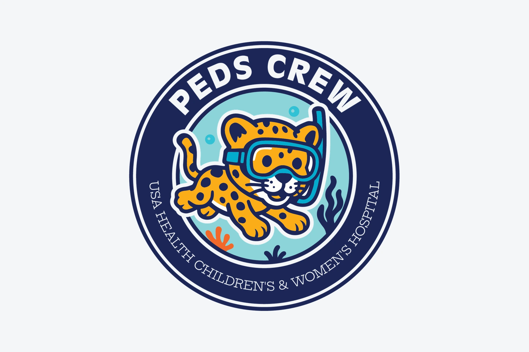
An underwater mascot badge for PEDS Crew.
A tall TPH monogram with an architectural rhythm.
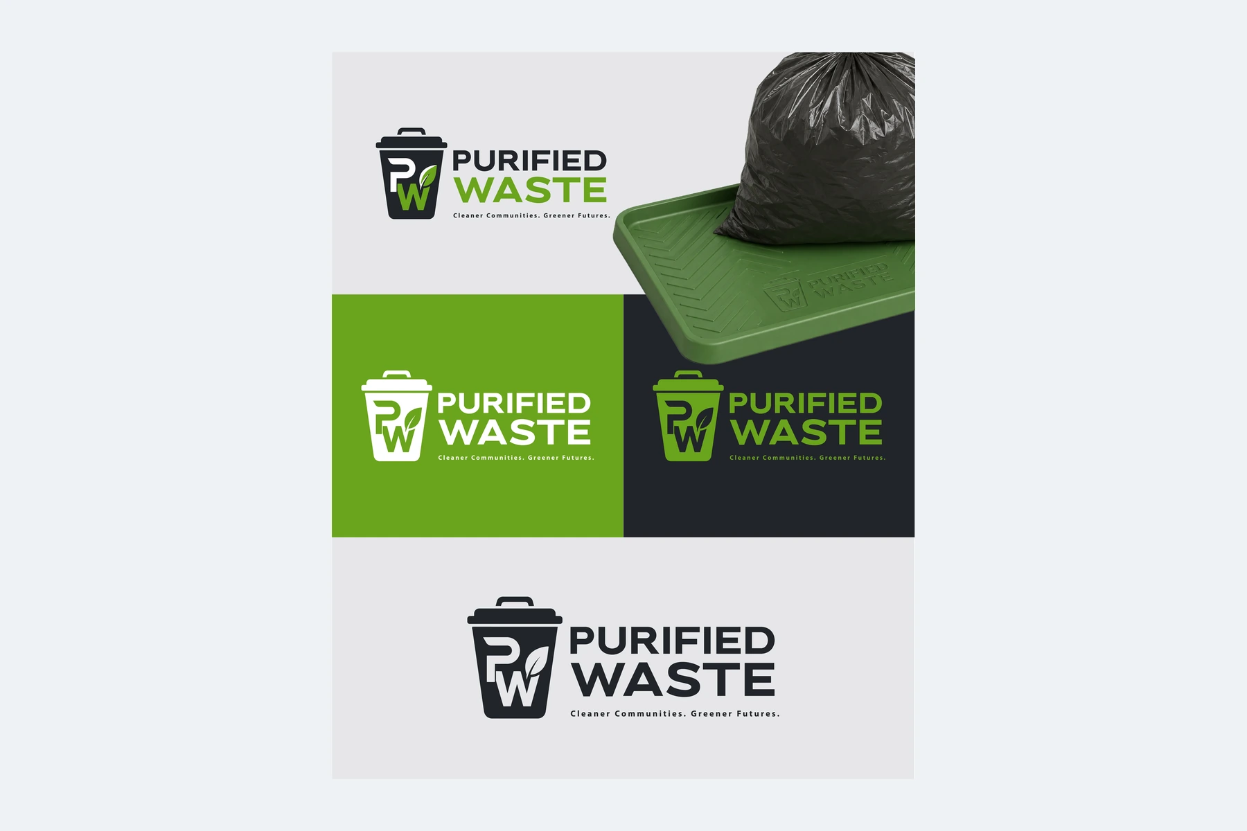
A waste-services identity shown in practical brand applications.
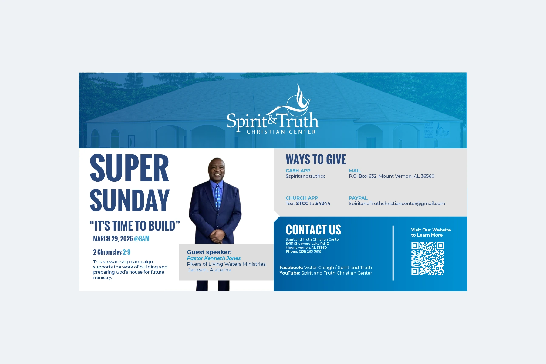
A blue-led event promotion with a clear information hierarchy.
A coordinated blue-and-white guide to the church.
Character-led line drawings for an eight-page coloring series.
A fresh fruit-inspired identity for a beverage brand, pairing a rounded green wordmark with a bright citrus emblem.
A nonprofit logo centered on the message “Every Addict Is Someone’s Child,” expressed through a butterfly and expressive lettering.
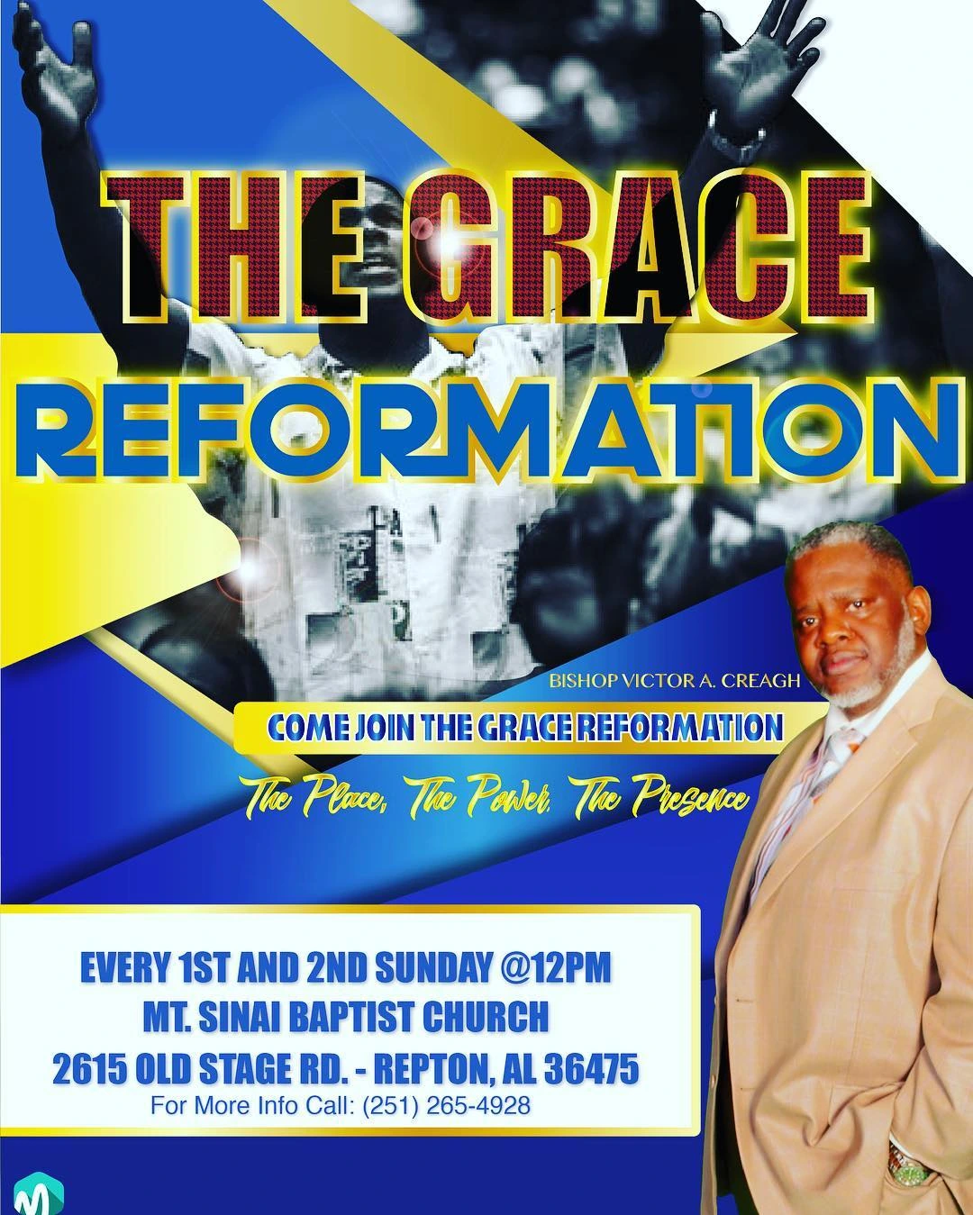
An event flyer for The Grace Reformation, using a layered blue-and-gold composition to introduce the gathering and its speaker.
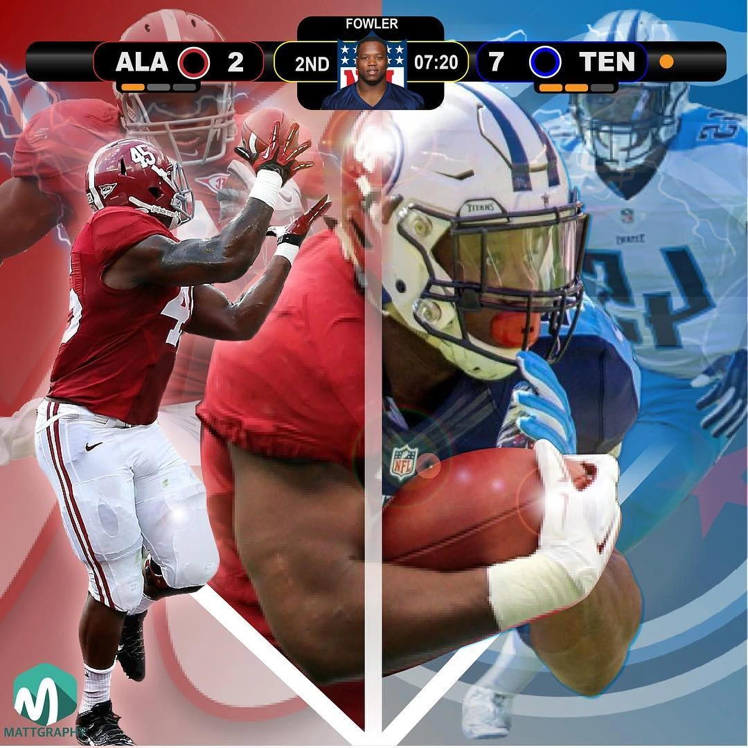
A pair of football poster designs celebrating Jalston Fowler through layered sports imagery and strong jersey-number graphics.
A maritime identity combining shipbuilding imagery with a nautical wheel, carefully arranged lettering and distinctive emblem construction.
A food-oriented wordmark concept combining the Epicurious name with a flowing Safari signature.
A lively food-brand logo combining a taco illustration, scattered ingredients and a large script wordmark.
A lawn-care logo built from compact lettering, a grass-inspired accent and a clear service-name hierarchy.
A beauty identity pairing a large handwritten Blake signature with a stylized initial and a soft pink palette.
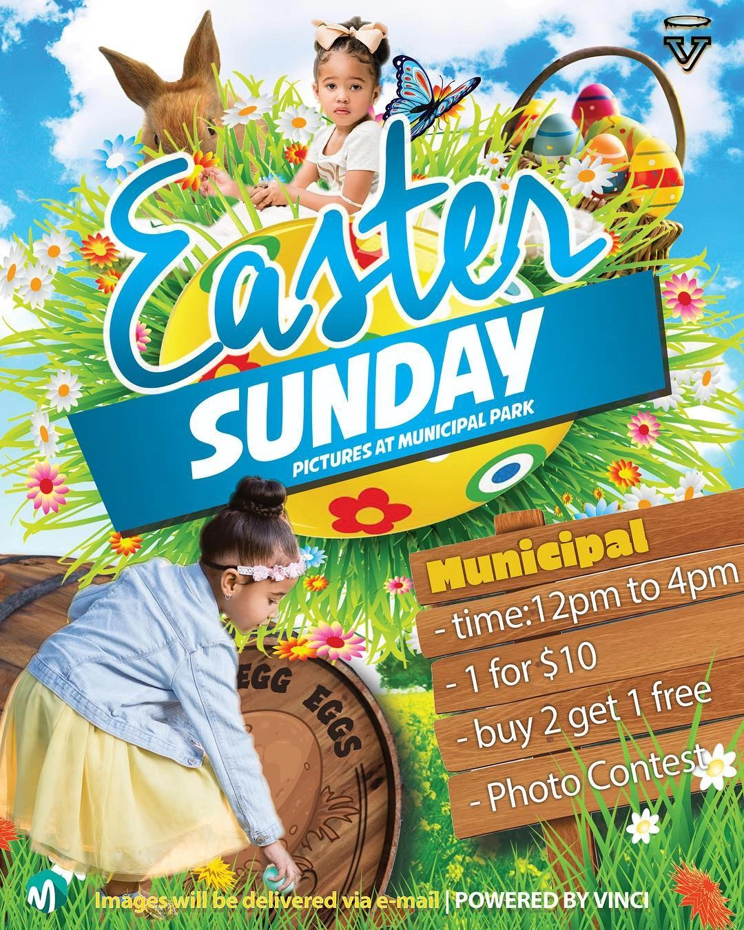
An Easter Sunday event flyer combining colorful seasonal illustration with a prominent event title and practical attendance details.
An apparel identity built around a compact interlocking monogram and widely spaced supporting lettering.
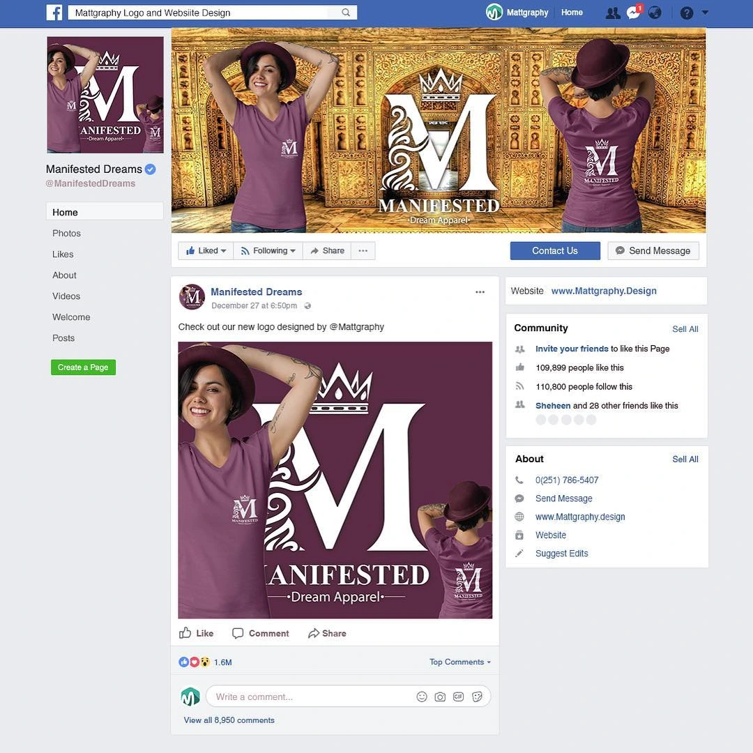
A regal apparel identity combining a crowned monogram, a prominent initial and a formal Manifested Dream wordmark.
A faith-centered identity that joins a cross, a dove and architectural letterforms inside a circular emblem.
A fashion identity centered on a flowing bU monogram and a clean Be Unique wordmark.
A coordinated social media presentation that extends Manifested Dream Apparel’s burgundy-and-gold identity into a digital promotional setting.
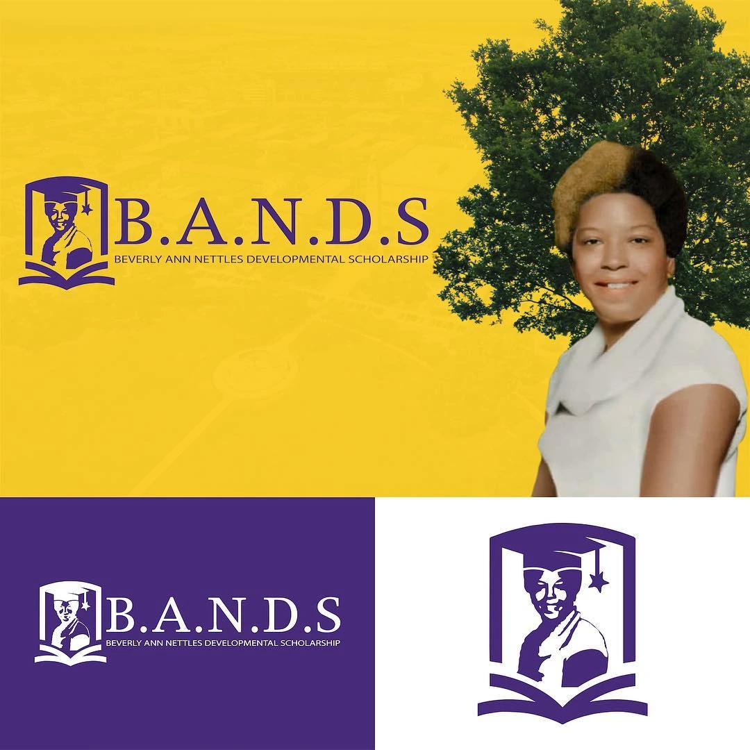
An organization logo that pairs a shield-like emblem with a formal B.A.N.D.S. wordmark and a purple-and-gold palette.
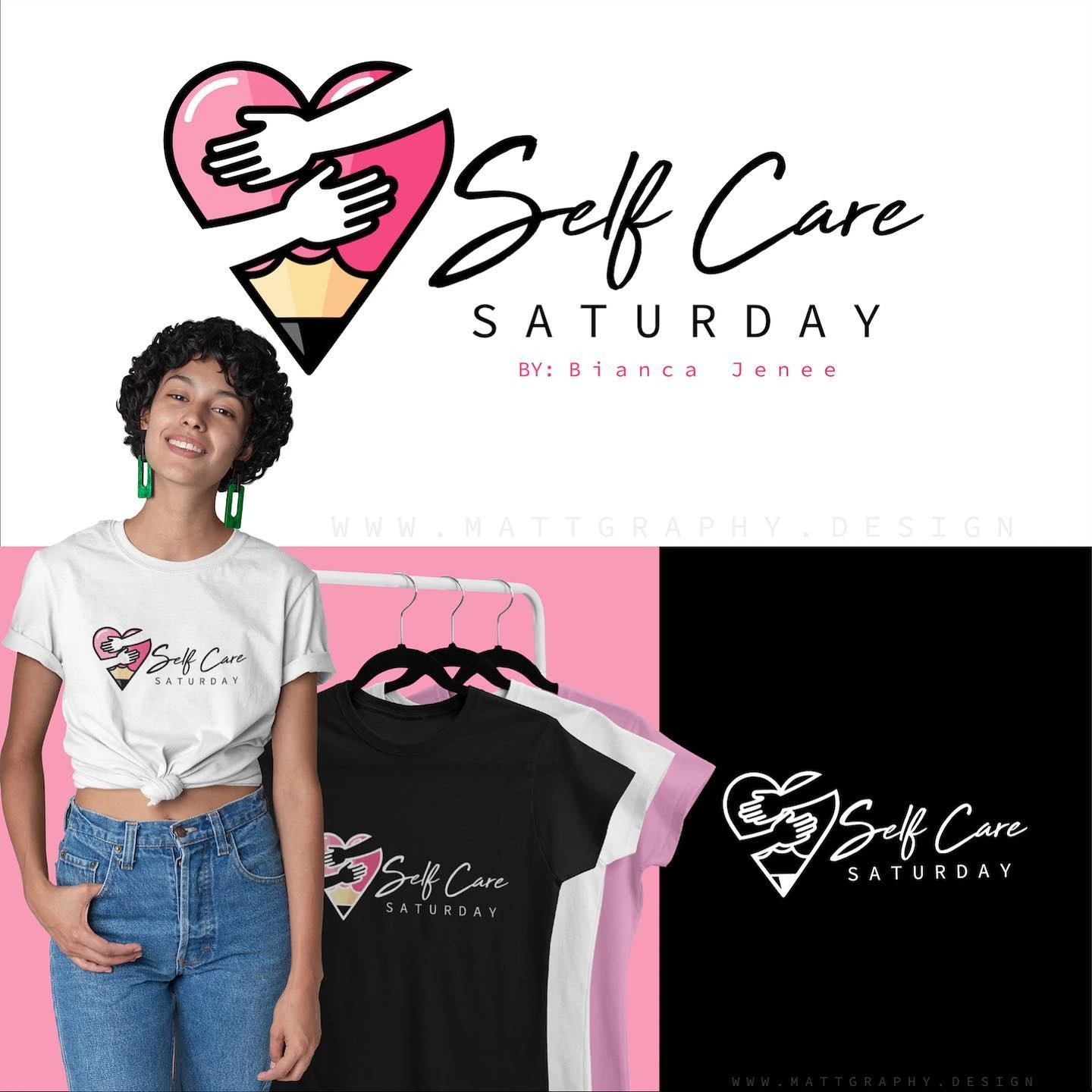
A wellness-event identity combining a heart-shaped emblem, expressive Self Care lettering and a clear Saturday descriptor.
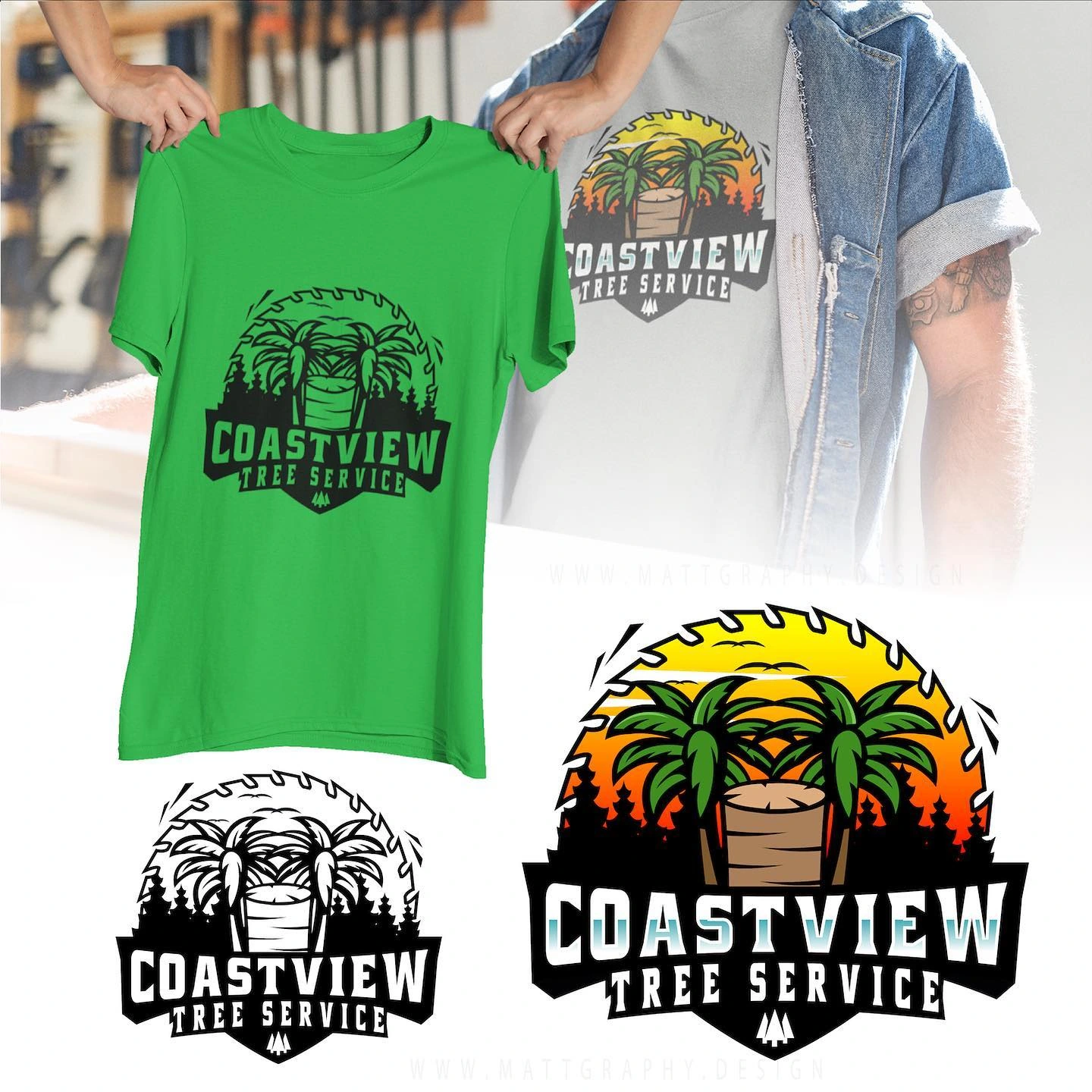
A tree-service identity built around a detailed tree illustration, a circular frame and strong stacked lettering.
An accounting and insurance identity combining rising geometric lines with a bold CWJ wordmark.
A fitness identity built around an oversized XL monogram and a narrow Fitness descriptor.
A lifestyle logo that joins a spinach-leaf illustration with a lightbulb shape and an expressive handwritten name.
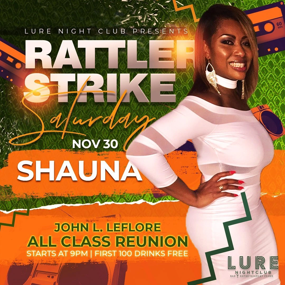
A pair of nightclub reunion flyers built around the Rattler Strike event and featured portrait photography.
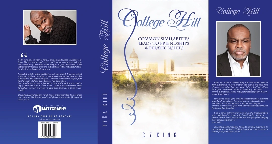
A complete book-jacket composition for College Hill, bringing the front cover, spine and back cover into one coordinated design.
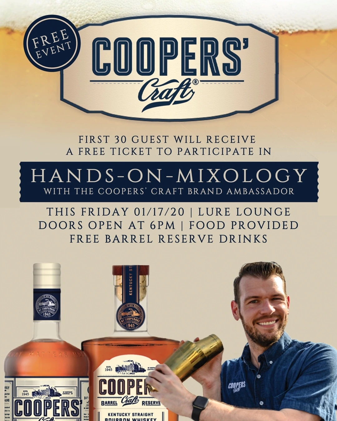
A spirits-event flyer introducing a Cooper’s Craft hands-on mixology experience through product photography and a clearly staged information hierarchy.
A farm-supply identity combining a livestock illustration, large A&D initials and a curved business-name descriptor.
A restaurant identity that pairs a playful illustrated character with a flowing Smooth Foods wordmark.
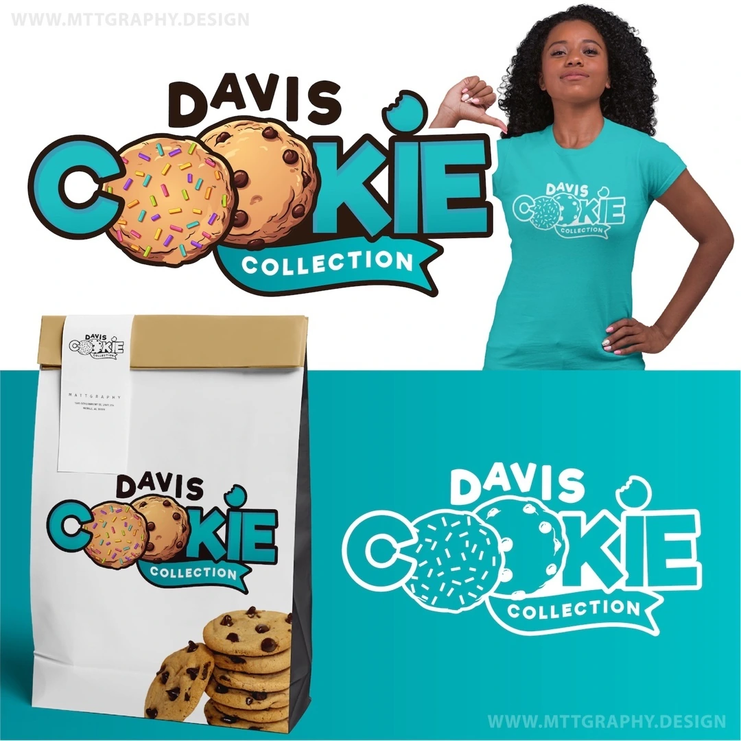
A bakery identity refinement that brings a cookie illustration into the Davis Cookie Collection name.
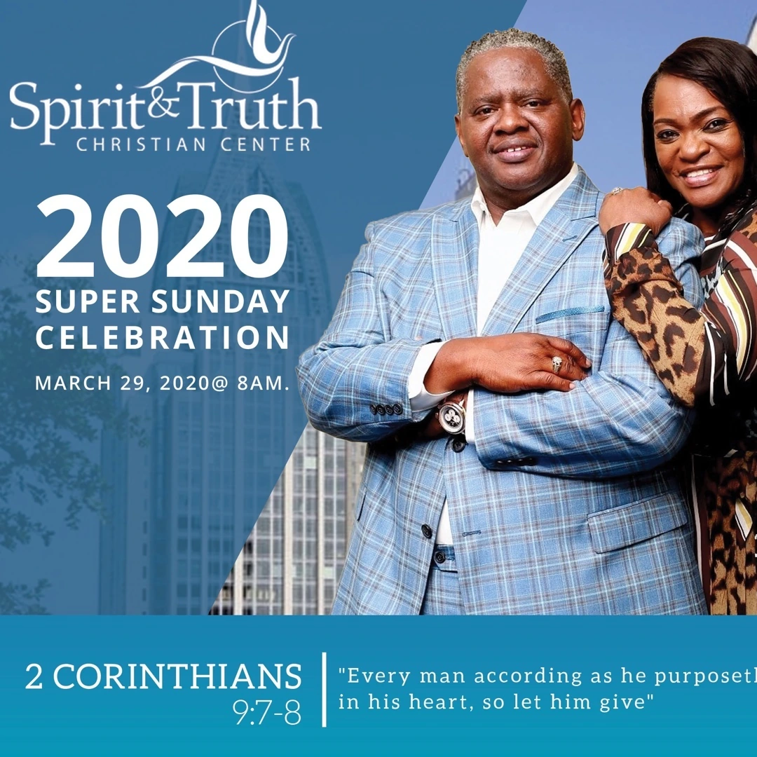
A church-event flyer that combines a pastoral portrait with a bold 2020 Super Sunday Celebration headline.
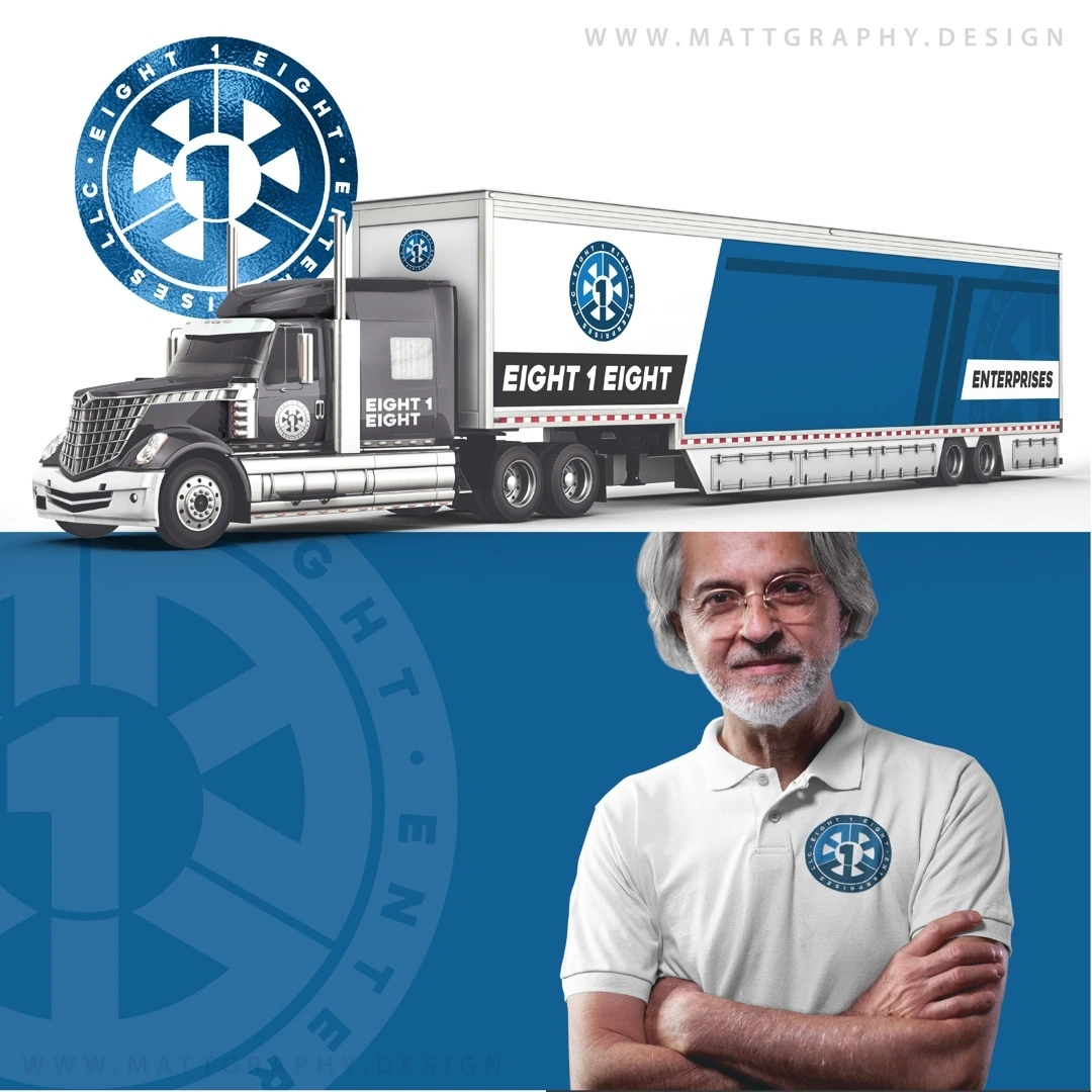
A logistics identity built around a circular numbered emblem and a bold compact wordmark.
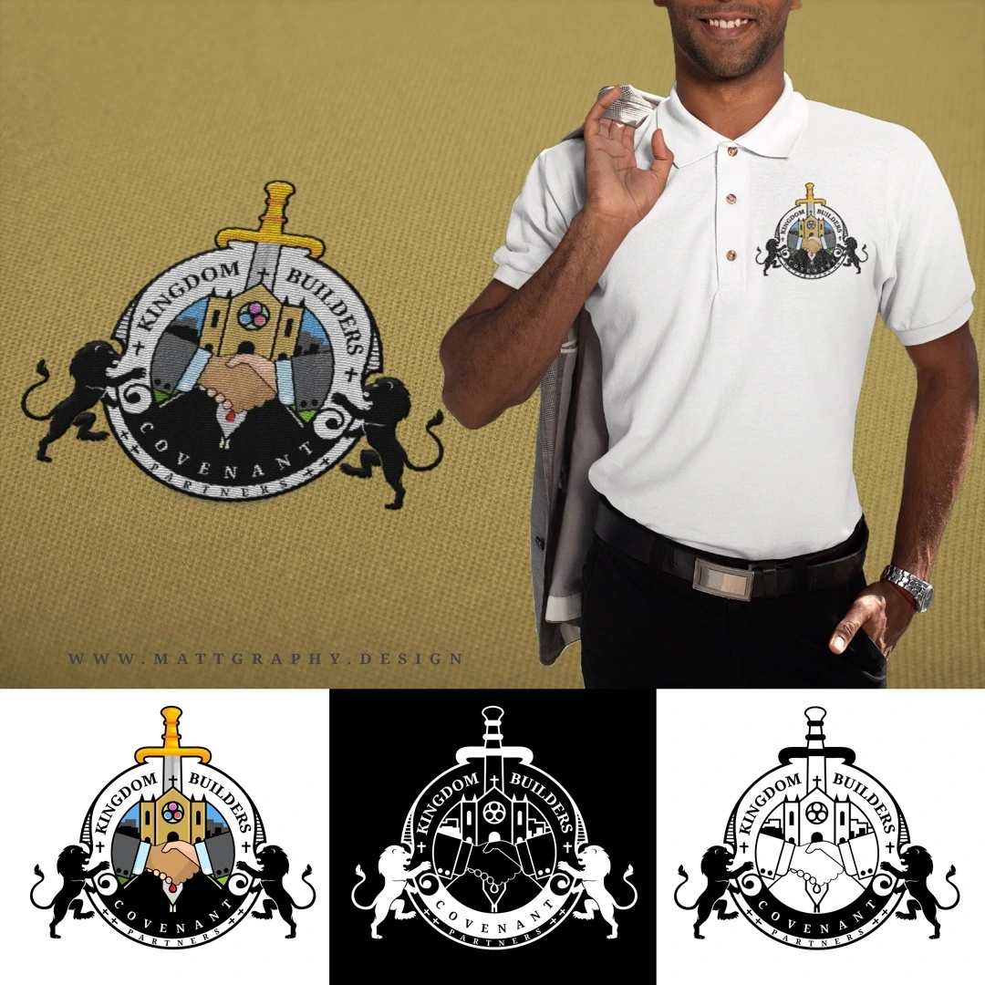
A faith-based emblem that brings together a church, a cross, clasped hands and heraldic supporting forms.
A billiards logo concept that combines a pool-ball cluster with a flowing Bumpers signature.
A beverage identity exploration combining fruit imagery, layered lettering and vivid packaging presentations.
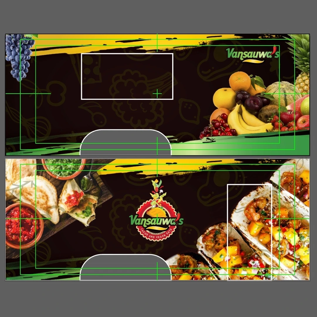
A full vehicle-wrap design that extends Vansauwa’s food identity across the large surfaces of a food truck.
An apparel identity pairing a confident figure silhouette with a bright circular setting and a layered script wordmark.
A fragrance and skincare identity built around a tall modular wordmark with integrated bottle-like details.
A venue identity built around a smiling illustrated face, oversized initials and a deliberately irreverent name.
A professional-services identity centered on a custom blue SYM wordmark and a clear accounting-and-consulting descriptor.
A bakery logo built as a circular seal with an elephant illustration, small decorative marks and a curved brand name.
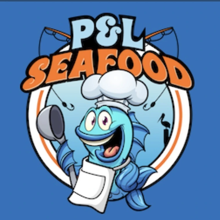
A seafood-market identity that uses a lively illustrated crab, a chef’s hat and large layered lettering.
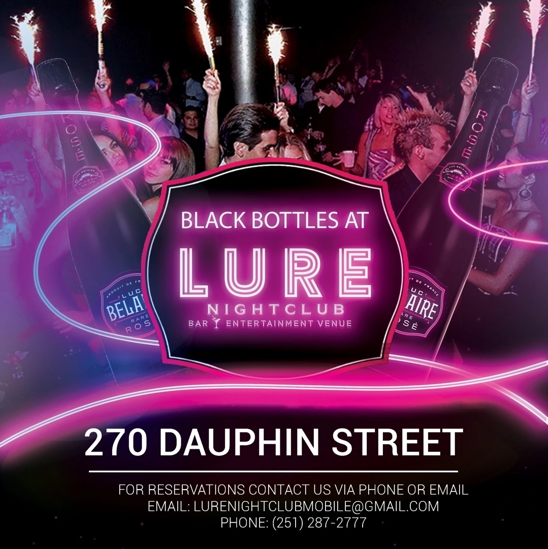
A nightclub flyer that uses a dark setting, neon pink accents and bottle imagery to promote a Black Bottles event.
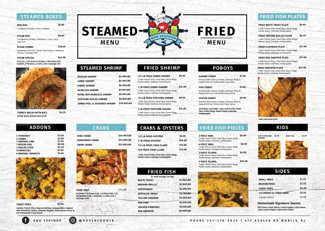
A seafood menu that organizes steamed and fried selections in a structured, image-supported layout.
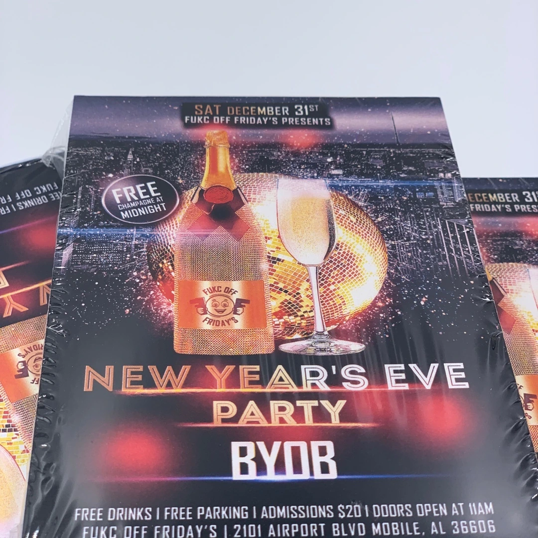
A New Year’s Eve party flyer combining an oversized celebratory year graphic with a dark nightclub setting.
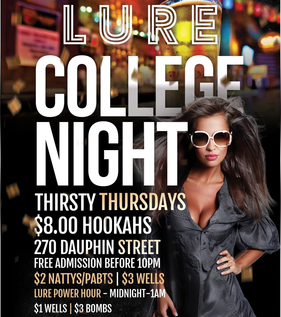
A college-night flyer for Lure, designed around tall condensed lettering, portrait photography and warm nightclub lighting.
A wellness identity combining a butterfly illustration with the HEW initials and the full Healing Essence Wellness name.
A martial-arts identity built around a circular badge, an interlocking central monogram and a clear location ring.
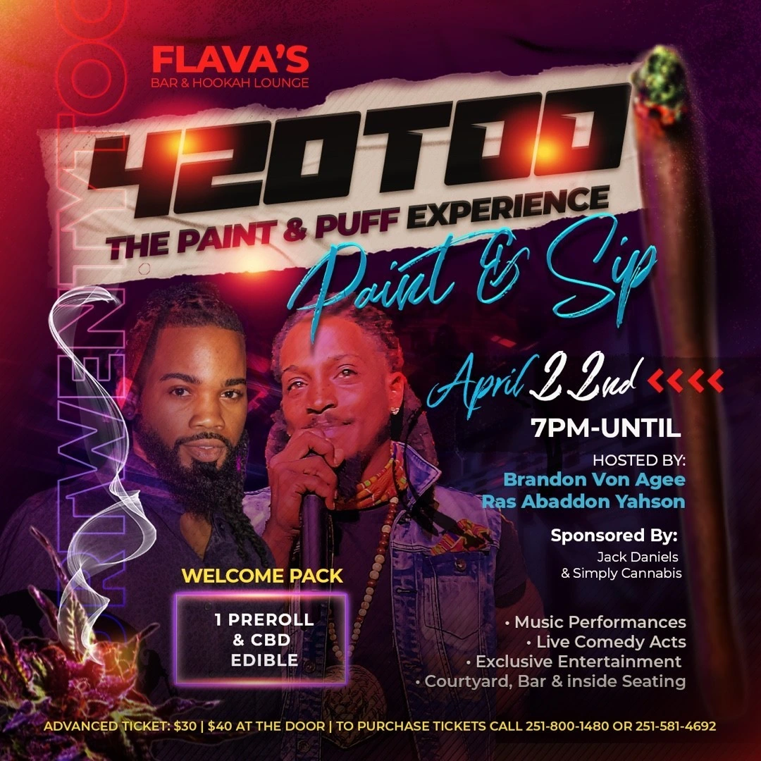
A themed paint-and-sip flyer using a large 420 headline, purple lighting and a layered portrait composition.
A podcast identity that turns a rising red bar motif into part of the All-N name.
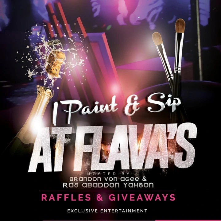
A paint-and-sip event flyer pairing large white lettering with paintbrush imagery, colored light and a dark celebratory background.
A barbershop identity combining scissors, clippers, comb-like forms and a compact stacked name.
A fashion identity combining an illustrated woman with a red circular name panel and expressive white lettering.
A children’s boutique identity using a playful silhouette, multicolor lettering and bright pink accents.
An apparel-oriented identity combining a goat silhouette with a formal Grand Goat Pair wordmark.
A boutique identity built around a sweeping EyeStruck signature, an abstract flourish and a small Boutique descriptor.
A cigar-brand identity pairing a script Cigarz name with a cigar illustration and a smaller Couture signature.
A law-firm identity combining a classical monogram-like emblem with a restrained serif wordmark.
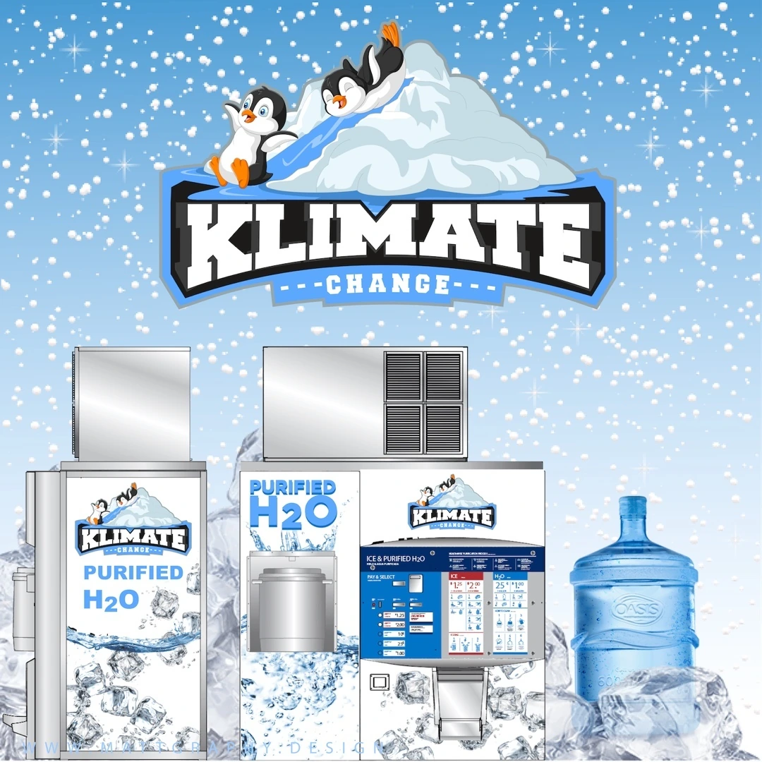
A product-brand concept that pairs illustrated penguins with a bold Klimate Change wordmark and a cool blue environment.
An apparel identity centered on a compact SR monogram and a small Street Runners wordmark.
A lingerie-brand identity that combines a flowing gold signature with a small Collection descriptor and a rich red presentation.
An entertainment identity centered on a linked HD monogram and a bold Hustlers & Divas name.
A hairstylist identity built around an elegant B monogram, a large Braids wordmark and a small By Vera LLC descriptor.
An updated cleaning-service identity that pairs a bird-like emblem with a flowing Kera signature.
A construction identity built as a circular workwear-style badge with illustrated heavy equipment and large Wack-N-Stack lettering.
A civic-office identity combining a custom OSI wordmark, a circular directional motif and the City of Mobile descriptor.
An awards identity built around a bold italic Trailblazer wordmark and compact South Alabama and Awards descriptors.
A professional accounting identity centered on an interlocking RM monogram within an open rectangular frame.
A University of South Alabama welcome identity built as a compact red-and-white badge.
A wellness identity combining an open butterfly outline with a flowing Evolve wordmark.
A seafood identity using a rounded rectangular badge, a large Jettie’s name and curved supporting lettering.
A restaurant identity that combines an illustrated chef character with a bold Cozy Brown’s Kitchen wordmark.
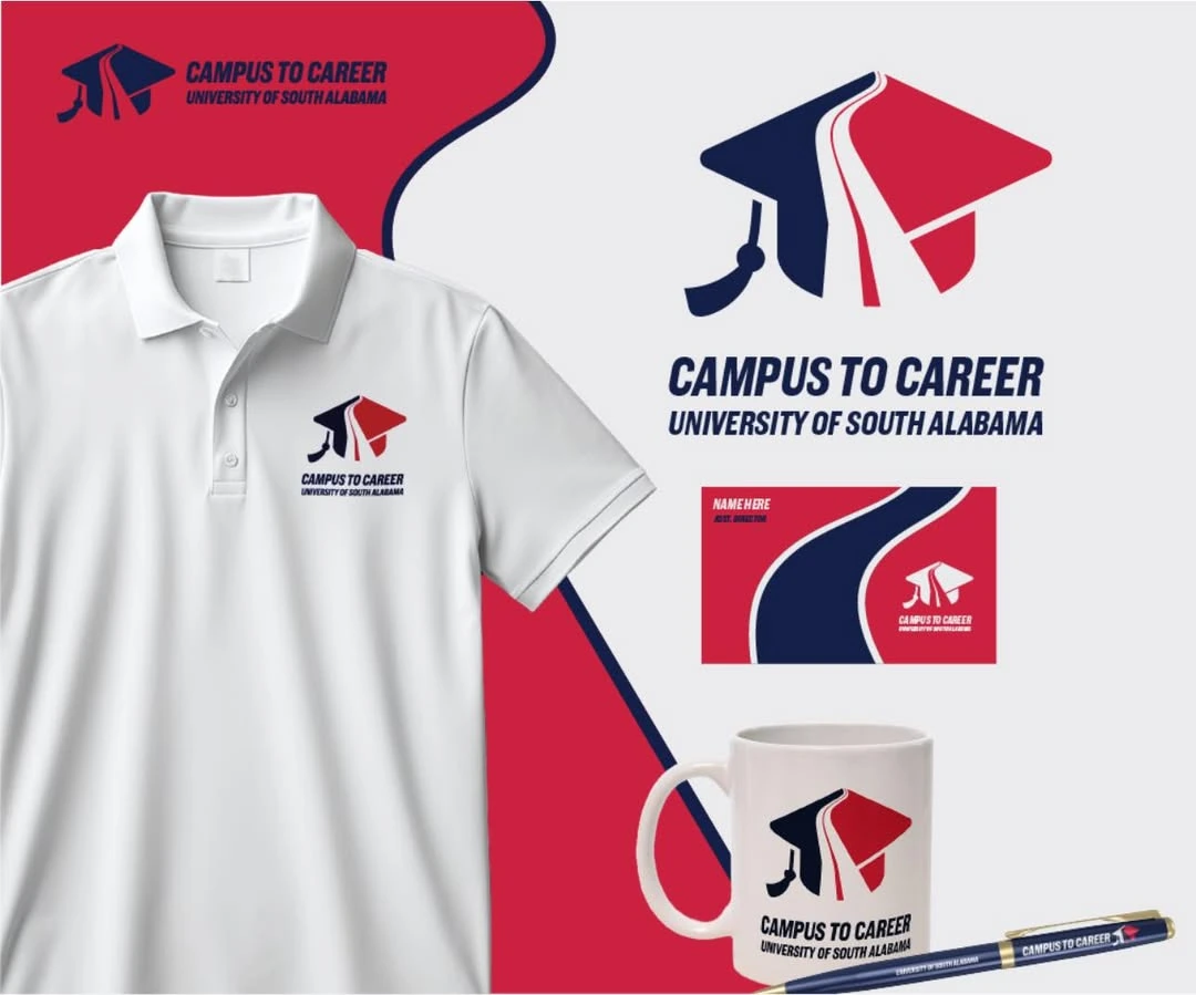
A University of South Alabama initiative identity that connects the transition from education to employment with a clear directional symbol.
A transportation identity that brings a red truck silhouette together with large D&I initials and a strong service descriptor.
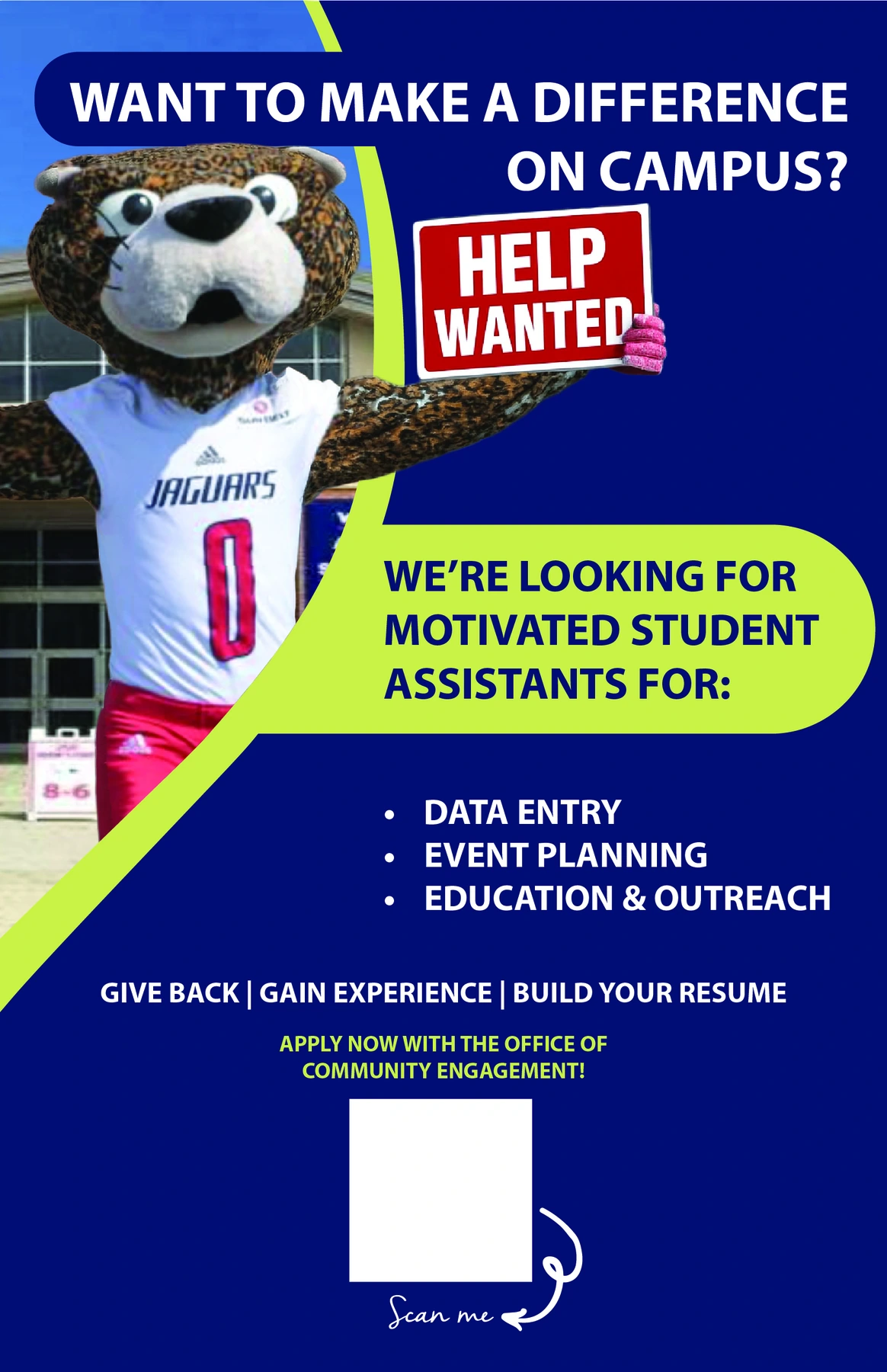
A campus recruitment flyer inviting students to contribute through assistant roles and university activities.
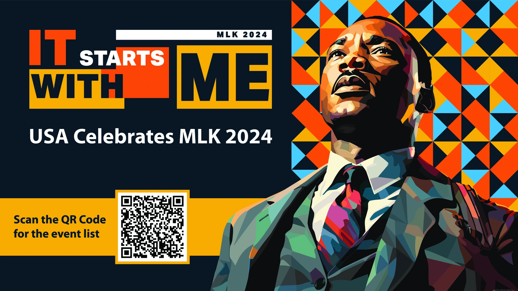
A landscape-format campus display for the university’s 2024 Martin Luther King Jr. celebration.
A logo presentation that joins a flowing purple Speak signature with a bright green plant-like Life form.
A coordinated Purified Waste presentation showing the identity across branded product and promotional mockups.