
Jeff’s Lawn Service — Logo Design
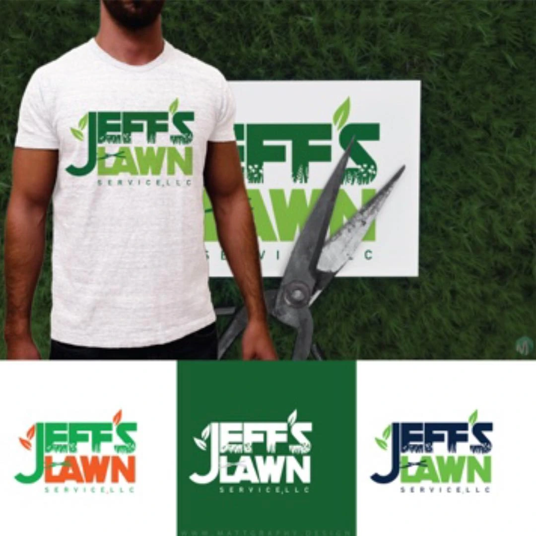
A lawn-care logo built from compact lettering, a grass-inspired accent and a clear service-name hierarchy.
Instagram archive · 2018
Project overview
A lawn-care logo built from compact lettering, a grass-inspired accent and a clear service-name hierarchy.
Visual direction
The green palette immediately connects the identity with landscaping. The stacked name gives the mark a broad, readable shape, while the small accent adds personality without overwhelming the lettering.
Design in context
Color alternatives and shirt mockups explore how the logo can retain its core proportions across light and dark backgrounds and different apparel placements.
Logo design and visual identity
The identity is presented through its central mark, supporting typography and contrast treatments. These elements establish the visual hierarchy: the symbol creates recognition, the name identifies the brand, and the smaller descriptor supplies context. Viewing the artwork together makes it possible to assess the logo’s proportions and personality as a complete brand identity. The presentation keeps the design visible at its original aspect ratio so the details of the lettering and illustration can be appreciated.