
XL Fitness — Logo Design
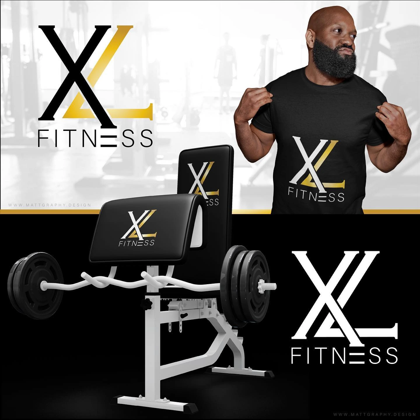
A fitness identity built around an oversized XL monogram and a narrow Fitness descriptor.
Instagram archive · 2019
Project overview
A fitness identity built around an oversized XL monogram and a narrow Fitness descriptor.
Visual direction
The crossing letterforms create a tall, distinctive mark. Black, white and gold treatments give the composition strong contrast, keeping the design focused on its silhouette rather than decorative detail.
Design in context
Shirt, bag and gym-oriented mockups place the monogram in relevant settings and show how the same symbol can anchor several branded surfaces.
Logo design and visual identity
The identity is presented through its central mark, supporting typography and contrast treatments. These elements establish the visual hierarchy: the symbol creates recognition, the name identifies the brand, and the smaller descriptor supplies context. Viewing the artwork together makes it possible to assess the logo’s proportions and personality as a complete brand identity. The presentation keeps the design visible at its original aspect ratio so the details of the lettering and illustration can be appreciated.