
Office of Strategic Initiatives — Logo Design
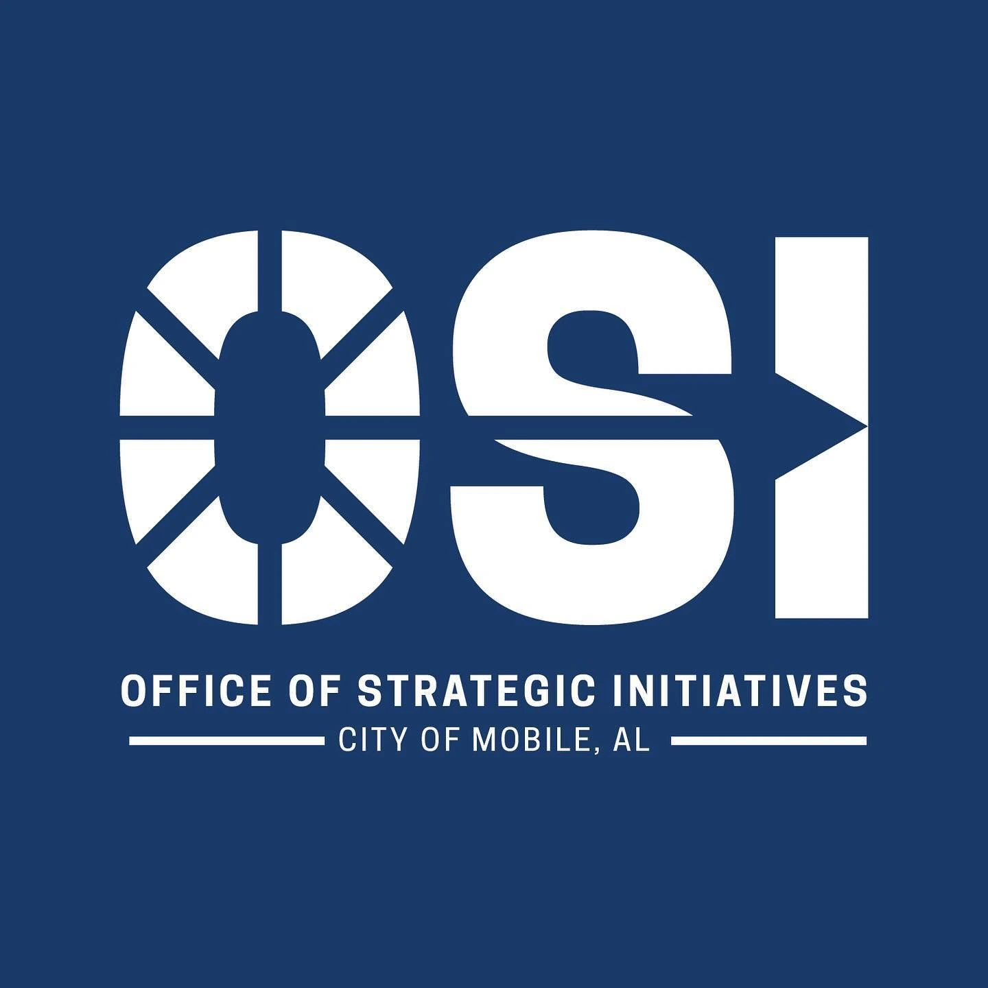
A civic-office identity combining a custom OSI wordmark, a circular directional motif and the City of Mobile descriptor.
Instagram archive · 2024
Project overview
A civic-office identity combining a custom OSI wordmark, a circular directional motif and the City of Mobile descriptor.
Visual direction
The white lettering stands clearly against a deep blue field. The segmented circular O and arrow-like details introduce movement while retaining the firmness of a simple three-letter mark.
Design in context
The smaller Office of Strategic Initiatives line explains the abbreviation, creating a readable hierarchy between the compact identity and the full office name.
Logo design and visual identity
The identity is presented through its central mark, supporting typography and contrast treatments. These elements establish the visual hierarchy: the symbol creates recognition, the name identifies the brand, and the smaller descriptor supplies context. Viewing the artwork together makes it possible to assess the logo’s proportions and personality as a complete brand identity. The presentation keeps the design visible at its original aspect ratio so the details of the lettering and illustration can be appreciated.