
Quenchers — Logo Design
A beverage identity exploration combining fruit imagery, layered lettering and vivid packaging presentations.
Instagram archive · 2020
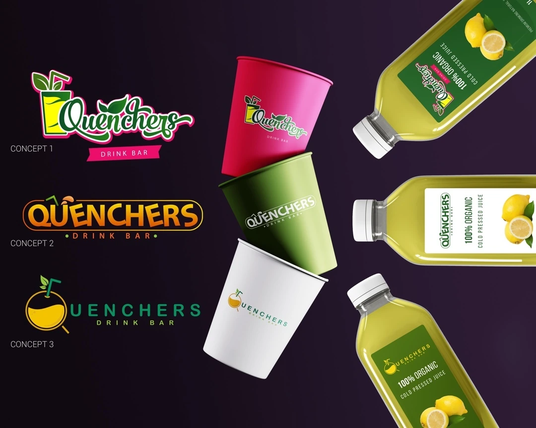
Project overview
A beverage identity exploration combining fruit imagery, layered lettering and vivid packaging presentations.
Visual direction
Green, red and yellow connect the concept with fresh flavors. The expressive Quenchers name provides the central graphic rhythm, while fruit details give the wordmark a clear product reference.
Design in context
Bottle and cup mockups show several logo treatments within a beverage range, exploring how the name and color palette can remain connected across different container shapes.
Logo design and visual identity
The identity is presented through its central mark, supporting typography and contrast treatments. These elements establish the visual hierarchy: the symbol creates recognition, the name identifies the brand, and the smaller descriptor supplies context. Viewing the artwork together makes it possible to assess the logo’s proportions and personality as a complete brand identity. The presentation keeps the design visible at its original aspect ratio so the details of the lettering and illustration can be appreciated.