
Styles by Blake — Logo Design
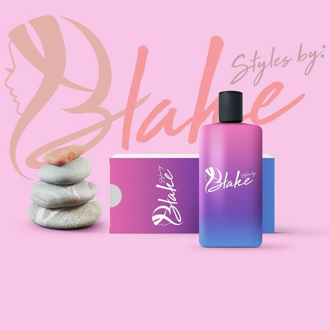
A beauty identity pairing a large handwritten Blake signature with a stylized initial and a soft pink palette.
Instagram archive · 2018
Project overview
A beauty identity pairing a large handwritten Blake signature with a stylized initial and a soft pink palette.
Visual direction
Sweeping strokes make the lettering the primary feature. The supporting Styles by line stays smaller and lighter, allowing the expressive name to carry the brand’s personality.
Design in context
Bottle and product mockups extend the signature into a beauty-product setting and demonstrate how the lettering relates to a compact label area.
Logo design and visual identity
The identity is presented through its central mark, supporting typography and contrast treatments. These elements establish the visual hierarchy: the symbol creates recognition, the name identifies the brand, and the smaller descriptor supplies context. Viewing the artwork together makes it possible to assess the logo’s proportions and personality as a complete brand identity. The presentation keeps the design visible at its original aspect ratio so the details of the lettering and illustration can be appreciated.