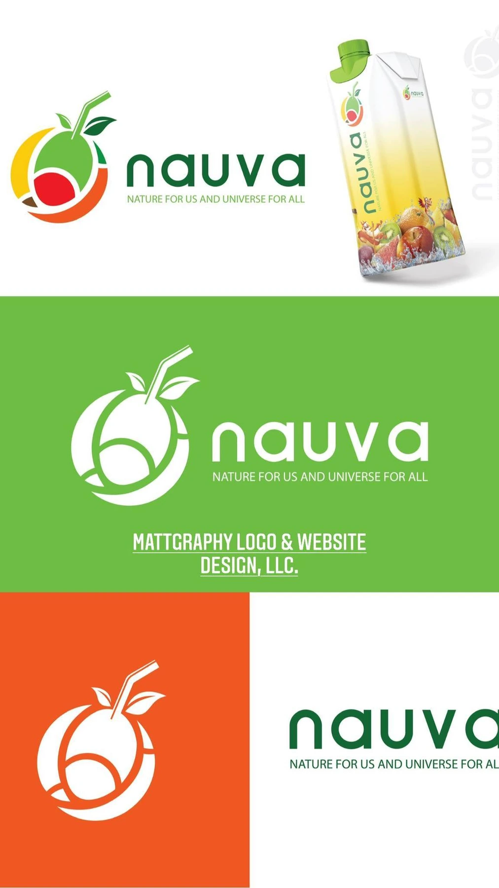
Nauva — Logo Design
A fresh fruit-inspired identity for a beverage brand, pairing a rounded green wordmark with a bright citrus emblem.
Project overview
A fresh fruit-inspired identity for a beverage brand, pairing a rounded green wordmark with a bright citrus emblem.
Visual direction
The orange slice, leaf and flowing circular form turn familiar ingredients into a compact brand symbol. Green and orange connect the lettering to the product palette, while white versions keep the mark clear against saturated backgrounds.
Design in context
The presentation brings the identity together with bottled-drink mockups, showing how a simple fruit mark can anchor a recognizable beverage label.
Logo design and visual identity
The identity is presented through its central mark, supporting typography and contrast treatments. These elements establish the visual hierarchy: the symbol creates recognition, the name identifies the brand, and the smaller descriptor supplies context. Viewing the artwork together makes it possible to assess the logo’s proportions and personality as a complete brand identity. The presentation keeps the design visible at its original aspect ratio so the details of the lettering and illustration can be appreciated.