
Purified Waste — Logo & Visual Identity
A waste-services identity shown in practical brand applications.
Project overview
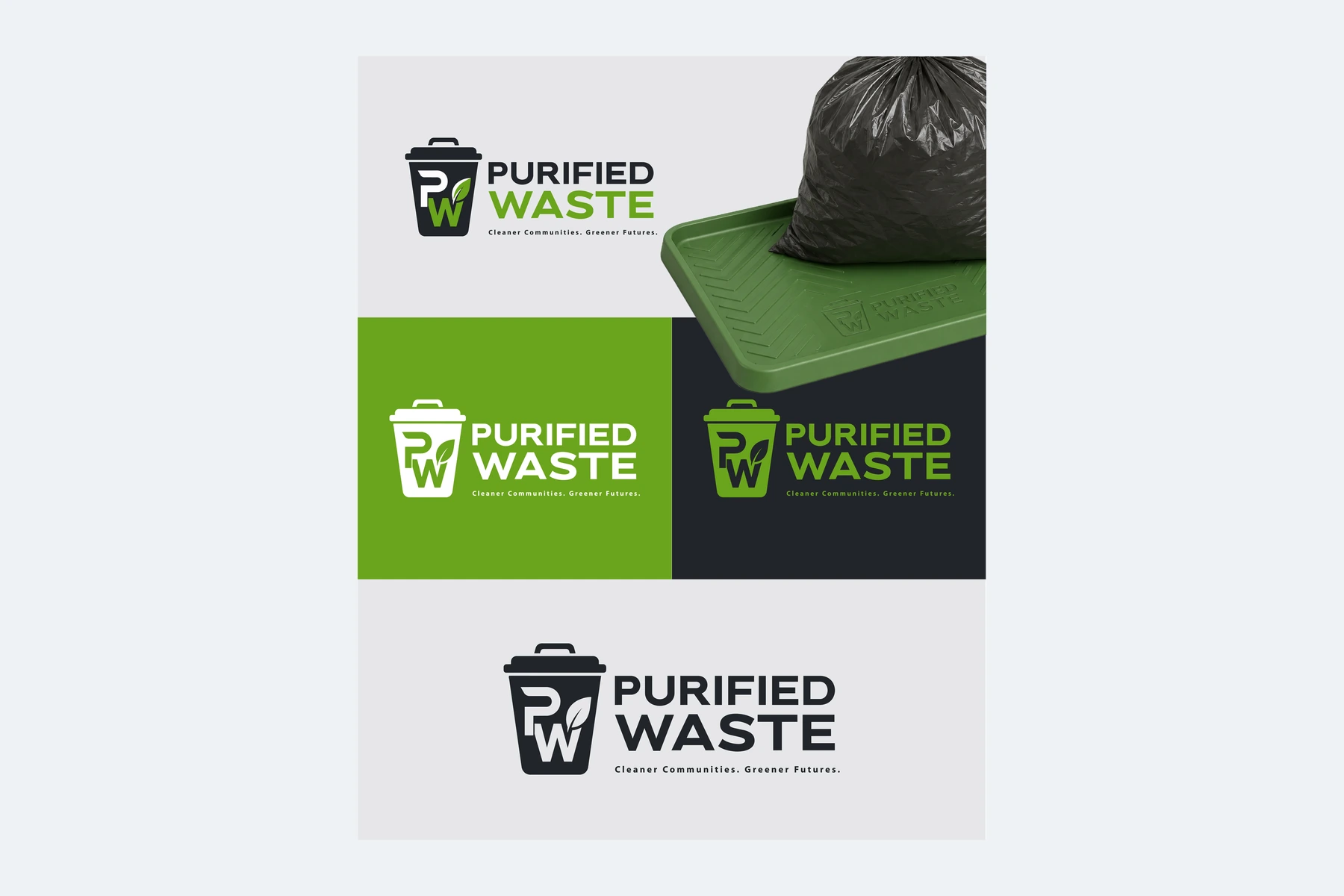
A black-and-green logo identity that combines a bin-inspired symbol with a strong stacked Purified Waste wordmark.
Visual direction
The bright green accent separates the second line of the name from the heavier black lettering above. The symbol introduces a direct reference to the business category, while the stacked arrangement gives the mark a compact, easily recognized silhouette.
Design in context
Black, white and green treatments demonstrate how the logo retains its central form as the background changes. The accompanying composite also contains application mockups, which are discussed on a separate marketing-design page.
Logo design and visual identity
The identity is presented through its central mark, supporting typography and contrast treatments. These elements establish the visual hierarchy: the symbol creates recognition, the name identifies the brand, and the smaller descriptor supplies context. Viewing the artwork together makes it possible to assess the logo’s proportions and personality as a complete brand identity. The presentation keeps the design visible at its original aspect ratio so the details of the lettering and illustration can be appreciated.