
Flava’s — 4/20 Paint & Sip — Marketing Design
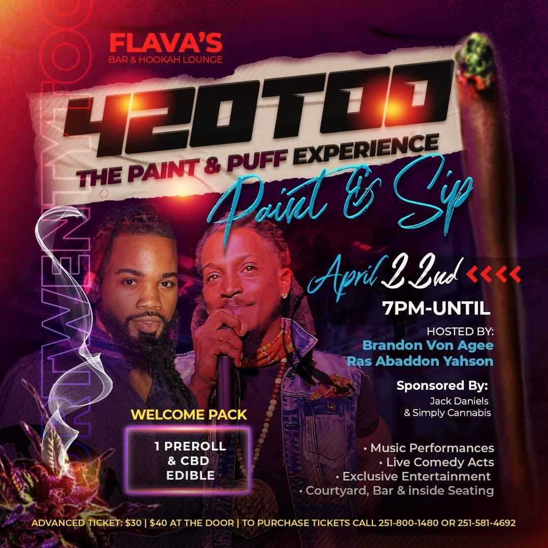
A themed paint-and-sip flyer using a large 420 headline, purple lighting and a layered portrait composition.
Instagram archive · 2021
Project overview
A themed paint-and-sip flyer using a large 420 headline, purple lighting and a layered portrait composition.
Visual direction
The event title receives the strongest scale, while a blue script Paint & Sip line adds contrast beneath it. Supporting information is grouped around the central portraits and the lower venue panel.
Design in context
The design combines an expressive nightlife aesthetic with a clear event date, time and activity hierarchy.
Graphic design and visual communication
The layout brings typography, imagery and supporting information into a deliberate reading order. Scale and contrast establish the first message, while smaller text carries the details needed to understand the offering. This is the practical role of marketing design: connecting a recognizable visual style with a specific piece of communication. The full artwork is presented without cropping so the complete composition, including its information hierarchy and surrounding space, can be considered together.