Specktrum — Logo Design
Expressive script, a sweeping K and a spectrum of color.
Design overview
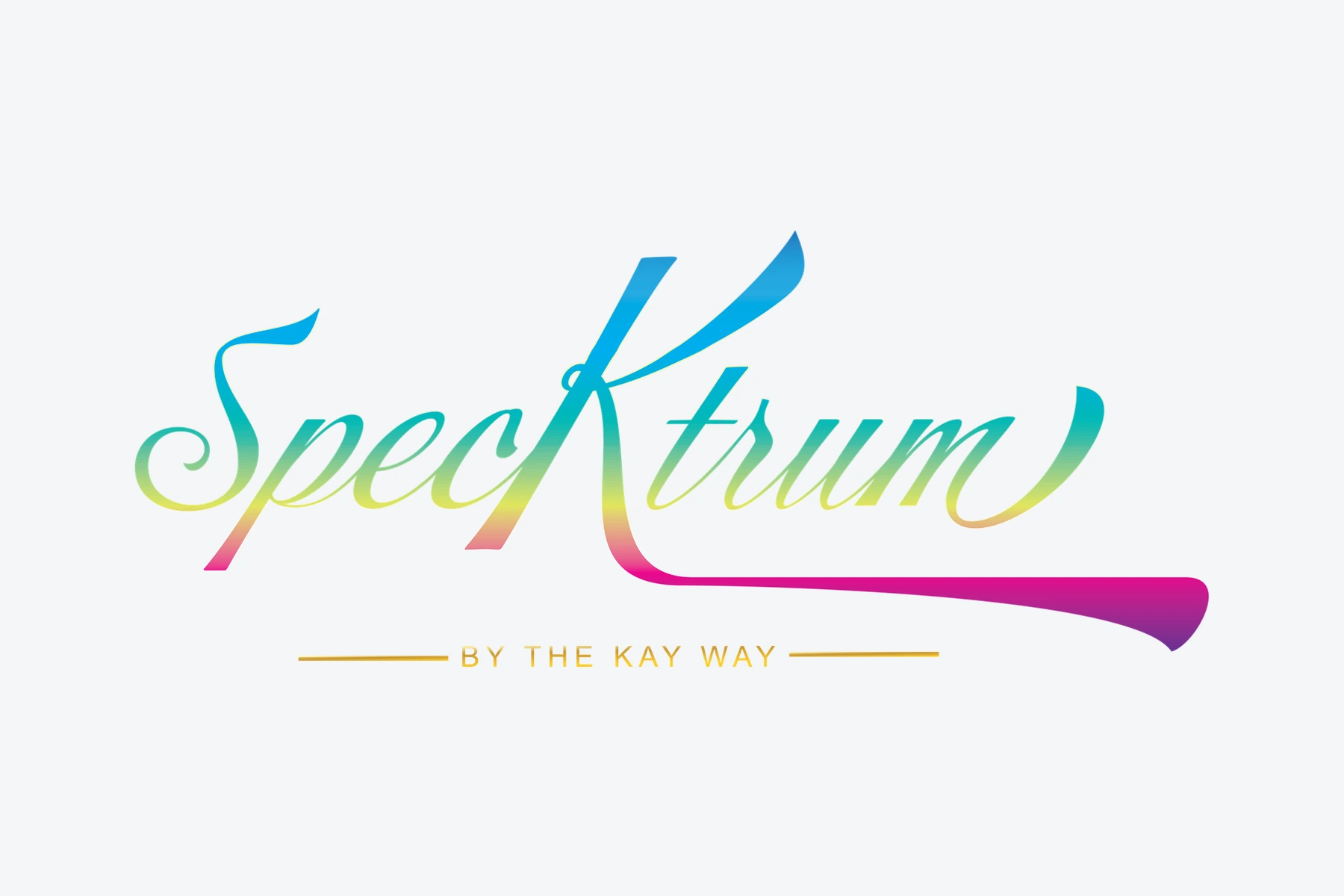
A script identity for Specktrum, with an extended letterform, a multicolor treatment and the supporting line “By the Kay Way.”
Visual approach
The oversized K becomes both a focal point and a long underline within the composition. The color version moves through a vivid spectrum, while black, white and gray treatments retain the same lettering. The small supporting line gives the flowing signature a stable baseline.
Project scope
Logo Design / Brand Identity.
Identity and application
The Specktrum identity brings its symbol, lettering and contrast treatments into one connected visual system. The full artwork allows the proportions of the mark and the smaller supporting details to be considered together. Each version retains the same central design language, helping the name remain identifiable as the background or placement changes. This project focuses on logo design and brand identity, with any presentation mockups serving to illustrate scale and context.