Platinum Cattle Sales
A bold cattle-industry logo built around a distinctive livestock illustration and western-inspired typography.
The Project
Platinum Cattle Sales needed a visual identity that could feel immediately connected to the cattle industry while remaining distinctive enough to stand on its own. The final logo brings together a strong livestock illustration, western-inspired typography, and a structured badge composition into one recognizable mark.
The Logo Direction
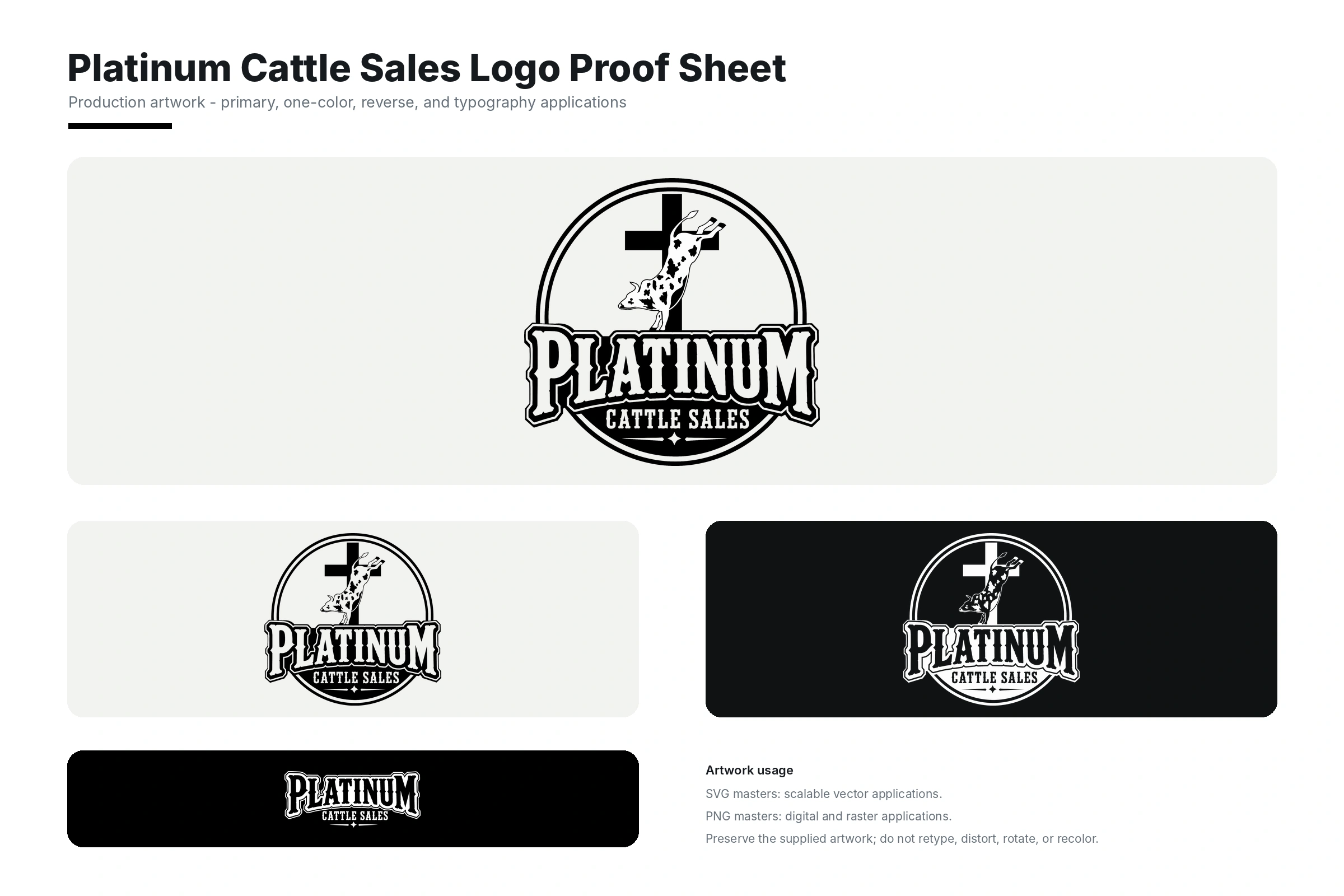
The primary mark centers on an illustrated cow positioned within a circular emblem and cross element. The composition is anchored by the oversized Platinum wordmark, with Cattle Sales positioned beneath it to clearly communicate the business name and industry.
The typography carries much of the logo’s personality. Its bold, western-influenced letterforms give the identity a rugged character without relying on unnecessary decorative elements outside the main mark.
A Flexible Logo System
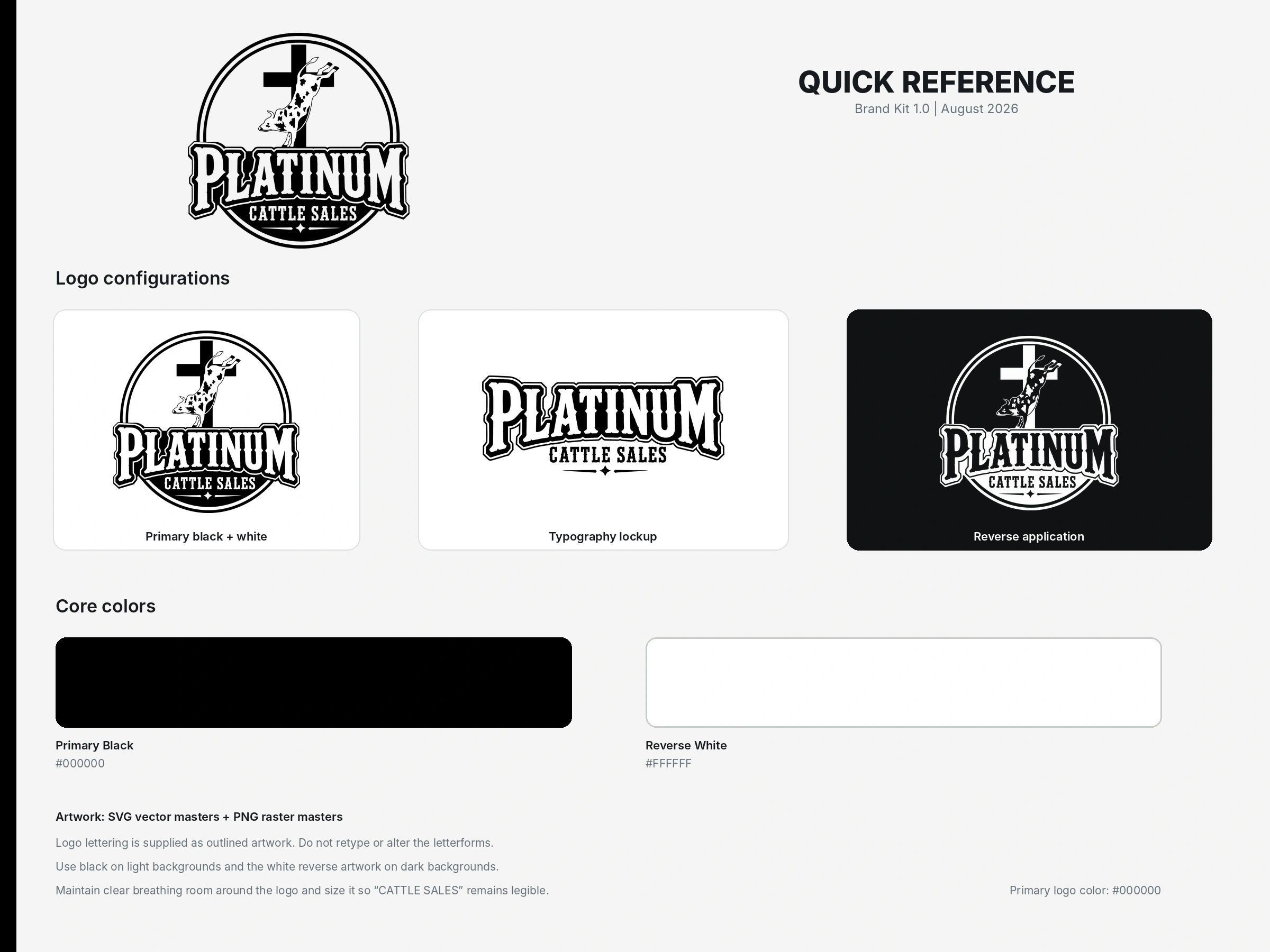
The logo was prepared in multiple configurations so the identity can remain consistent across different applications. The supplied artwork includes the complete primary mark, typography-focused artwork, isolated graphic elements, and black-and-white variations.
The monochrome structure allows the logo to work effectively in both dark and light applications while preserving the recognizable cattle illustration, wordmark, and overall silhouette.
What We Created
- Primary logo composition
- Black logo application
- Reverse white logo application
- Typography-focused logo configuration
- Standalone cattle illustration
- Vector-ready logo artwork