
Eight Eight — Logistics Identity — Logo Design
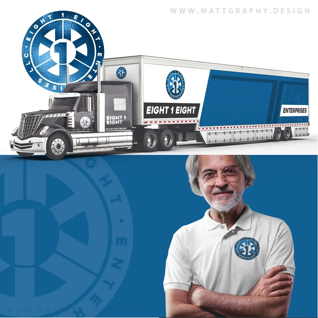
A logistics identity built around a circular numbered emblem and a bold compact wordmark.
Instagram archive · 2020
Project overview
A logistics identity built around a circular numbered emblem and a bold compact wordmark.
Visual direction
The repeated eight forms create the central symbol, while blue and white provide strong contrast. The surrounding ring and simple geometry give the logo a stable shape suited to large branded surfaces.
Design in context
Truck and uniform mockups explore the identity at two different scales, connecting the compact badge with a broader transport-business presentation.
Logo design and visual identity
The identity is presented through its central mark, supporting typography and contrast treatments. These elements establish the visual hierarchy: the symbol creates recognition, the name identifies the brand, and the smaller descriptor supplies context. Viewing the artwork together makes it possible to assess the logo’s proportions and personality as a complete brand identity. The presentation keeps the design visible at its original aspect ratio so the details of the lettering and illustration can be appreciated.