Brighter Tomorrow Homes
Designing a Nonprofit Website Around Clarity, Dignity, and Trust
Good nonprofit design begins with what people need to understand
A nonprofit website often has to serve several kinds of visitors at the same time. Some people arrive to learn about the mission. Others are looking for admissions or referral information, ways to volunteer, partnership opportunities, career information, or a direct path to giving. The challenge is not simply placing all of that content online. The challenge is giving each visitor a clear next step without turning the homepage into a wall of competing messages.
The Brighter Tomorrow Homes website addresses that challenge by building the experience around a strong sequence: purpose first, support model second, action paths next, and contact guidance where it is needed. That structure helps the site remain warm and expressive while still functioning as an organized source of information.
Lead with purpose, then give people a next step
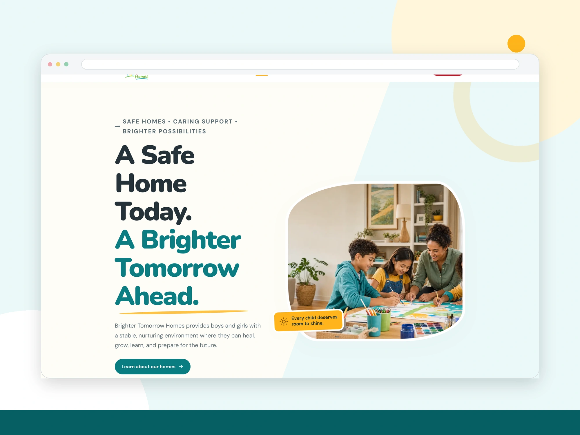
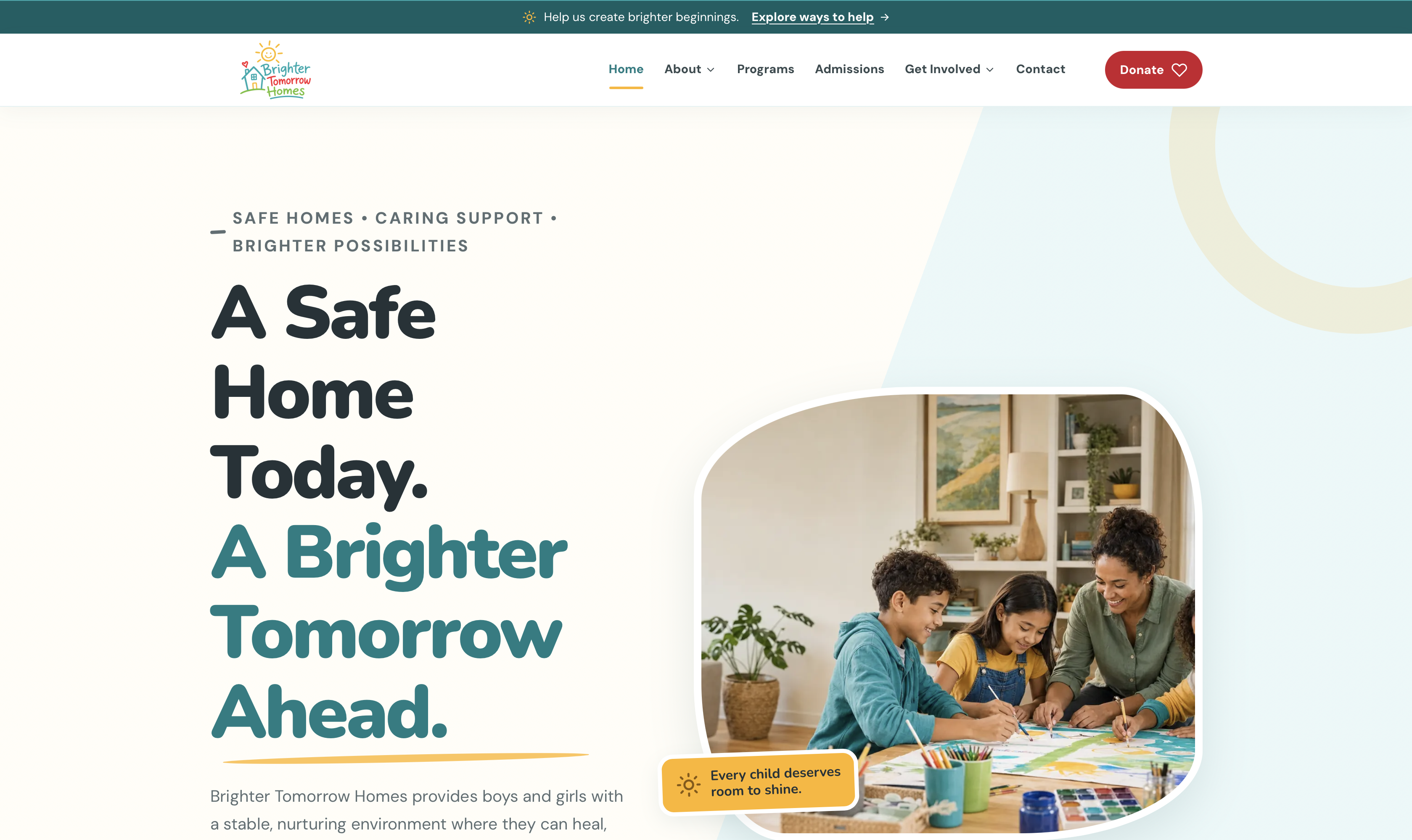
The homepage opens with the message “A Safe Home Today. A Brighter Tomorrow Ahead.” It is an emotional statement, but it is immediately supported by plain language explaining that the organization is focused on providing boys and girls with a stable, nurturing environment where they can heal, grow, learn, and prepare for the future.
Two primary actions sit close to that message: learning about the homes and supporting the mission. This is an important design choice. A mission statement creates attention, but a clear call to action turns that attention into movement. Visitors do not have to search the navigation to understand what they can do next.
Turn a broad mission into a visible system
Care-focused organizations can be difficult to explain because their work is rarely limited to one service. The Brighter Tomorrow Homes site uses four cards to organize its whole-child support model: Safe & Supportive Homes, Education & Life Skills, Recreation & Enrichment, and Personal Growth & Well-Being.
The cards create a practical overview without requiring visitors to read a long block of institutional language. Each category has its own icon, number, heading, and description, but the cards share the same structure. That consistency makes the information easier to scan and reinforces that the four areas belong to one coordinated approach.
The next section turns the care process into three stages: Welcome, Nurture, and Prepare. This sequence gives the visitor a simple mental model. First, a young person is welcomed into a safe and respectful transition. Next comes daily care, structure, enrichment, and individualized support. Finally, preparation focuses on what comes next, whether that is reunification, another permanent placement, or independent adulthood when applicable.
Use design to separate confirmed information from pending information
One of the most responsible details in the supplied website is the way it handles information that has not yet been verified. The admissions area includes designated fields for ages served, referral sources, service area, placement types, current capacity, and required documents, but those values are marked as pending confirmation.
That may seem like a small content decision, but it reflects a larger principle: a professional website should not make incomplete information look official. Creating a clear place for the content allows the organization to see what still needs to be supplied, while the visible verification message prevents visitors from mistaking placeholders for approved policy.
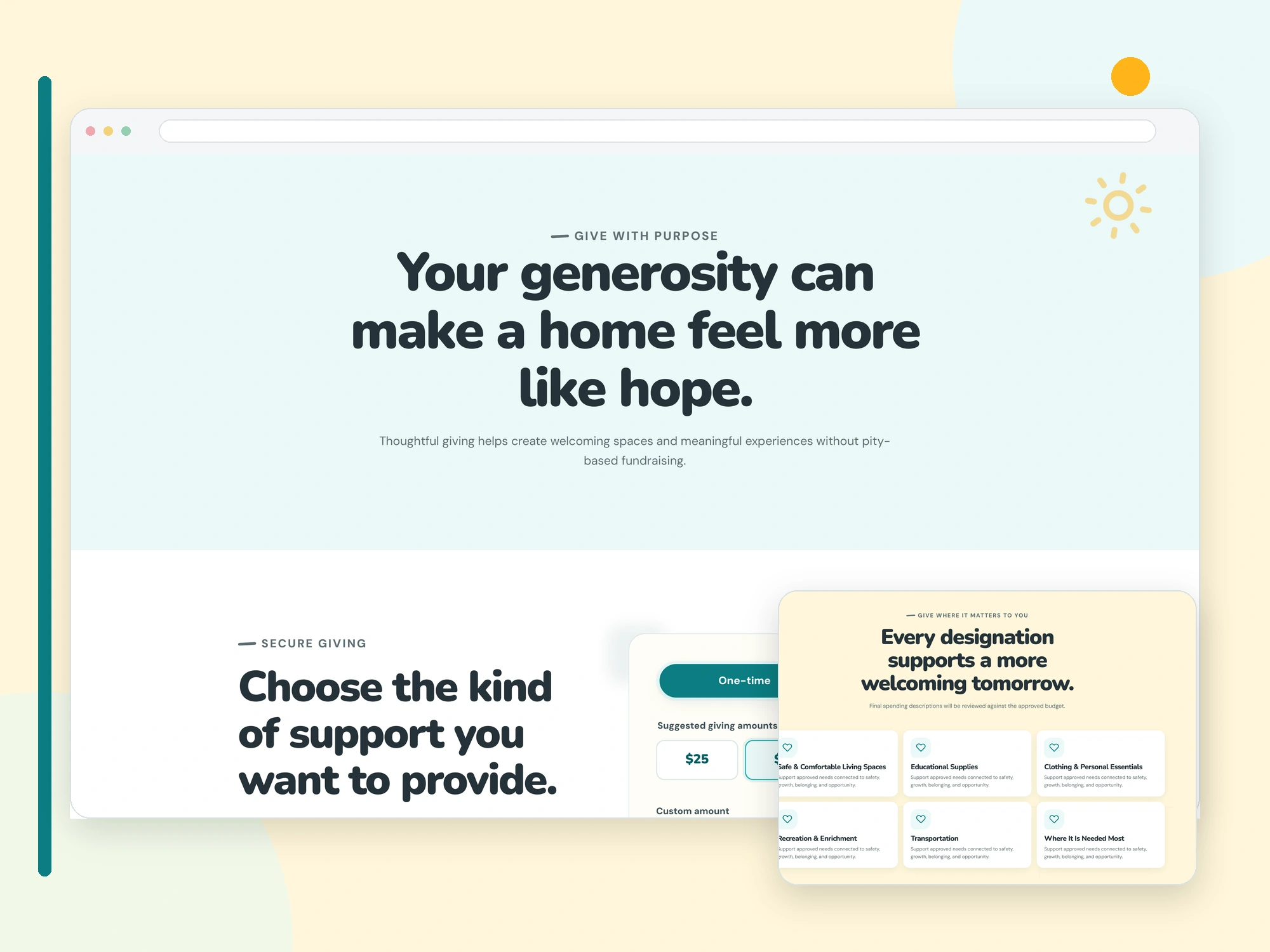
The donation page follows the same approach. Tax-deductibility language is not presented as final until legal status is verified, and spending descriptions are identified as subject to review against the approved budget. This keeps the design useful without allowing the interface to overstate what has been formally established.
Privacy guidance should be part of the experience
Privacy is especially important when a website relates to children, foster care, placements, or sensitive personal circumstances. The Brighter Tomorrow Homes contact form does more than collect a name, email address, phone number, reason for contact, and message. It includes consent language and warns visitors not to submit medical, mental-health, placement, or child-identifying information.
That guidance appears at the moment a visitor is preparing to send information. Placing it beside the form is more useful than relying only on a separate privacy page because it affects behavior at the point of action. The site also states that residential locations are not published for privacy and safety, reinforcing the same boundary in the footer.
Make the giving experience transparent
The donation page uses a focused structure that lets visitors choose between one-time and monthly support, select a suggested amount, enter a custom amount, and choose a gift designation. The available designations connect giving to understandable areas such as living spaces, educational supplies, clothing and personal essentials, recreation and enrichment, transportation, or the area of greatest need.
Just as important, the page explains the boundary between the website and the payment processor. Payment details are entered on a verified processor’s secure page, the website does not store card information, and the processor issues the receipt. Those statements help visitors understand what happens after they continue, without making unsupported promises about the transaction itself.
Responsive design is content prioritization
The mobile capture shows that the experience was not reduced to a smaller desktop page. The navigation becomes a compact mobile control, the hero actions expand across the available width, the support cards stack vertically, the Welcome-Nurture-Prepare pathway becomes a clear scrolling sequence, and the contact form fields adapt to the narrower screen.
This is what responsive design should accomplish: preserve the meaning and order of the content while changing its presentation to match the device. The visitor still encounters the same mission, support model, ways to help, privacy guidance, and contact path, but in a format that can be read and used comfortably on a phone.
What other organizations can take from this approach
- Start with one clear promise. Use the opening section to explain why the organization exists before introducing every program or action.
- Group related services into a system. Consistent cards and labels make broad work easier to understand.
- Show the process. A short sequence can explain how support unfolds more clearly than a long paragraph.
- Label unverified information honestly. A temporary placeholder is better than a confident but unsupported statement.
- Place privacy guidance near the action. Tell visitors what not to submit before they send a form.
- Explain the giving handoff. Visitors should understand when they are leaving the website for a secure processor and who handles payment information and receipts.
A strong nonprofit website does not need to overstate
The strongest part of the Brighter Tomorrow Homes experience is not a dramatic claim or a fabricated success metric. It is the combination of an approachable visual language, a clear information hierarchy, careful privacy boundaries, and honest verification messaging. Together, those elements create a website framework that can grow as the organization confirms its admissions details, contact information, legal status, and future stories.