Kerning
The adjustment of space between individual letter pairs.
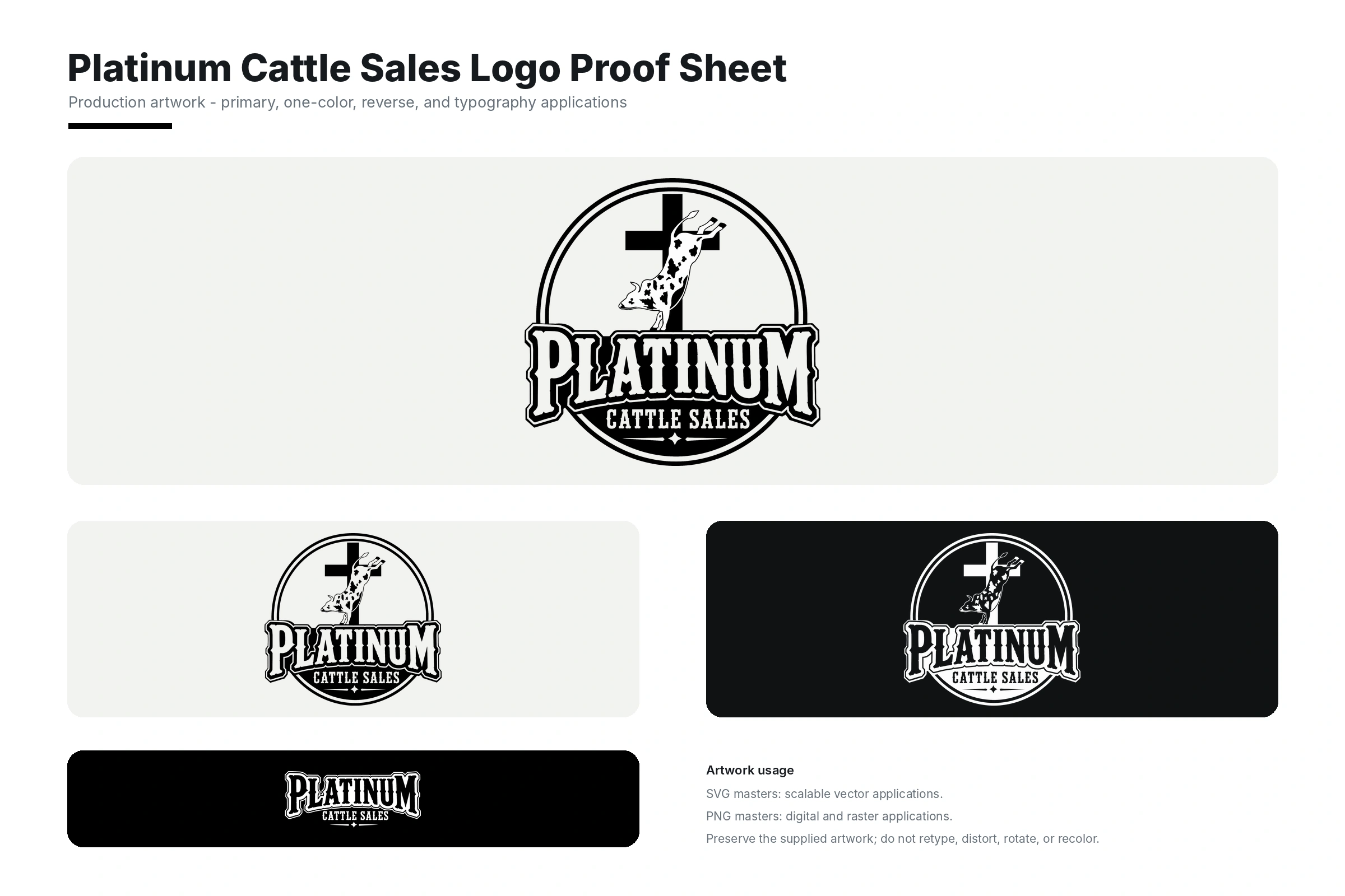
Kerning fine-tunes the visual space between two specific letters. Good kerning helps words feel balanced and intentional, especially in logos, headlines and large display type.
Need help with this?
Tell us what you are creating and where this term fits into the project.
Ask MattgraphyRelated services
View all services Services connected to this term.
Latest work